How to use Acrylic Paint with Crepe Paper - Part 2

Muted paper flower bouquet recreated for a special client.
In this third post of my “Colour My Florals” series, I’m going back to acrylics and sharing another way of painting my crepe paper using this versatile medium for my paper flower sculptures.
DISCLOSURE — When you click on my affiliate links, I may earn a commission for qualifying purchases made through Amazon.com links in this post. This commission goes directly into the maintenance of my website, the technology that goes into my courses, and my art. Want to know more? Read my AMAZON AFFILIATE DISCLAIMER.
I’ve talked about this in the past (and in-depth in my Icelandic Poppies Online course) - to create depth and interest, I always work with an underlying colour and then layer colour on top. Just like painting on canvas, I like to set the undertones first. I usually prefer a white undertone: it creates easy to achieve highlights and it tends to brighten the colour that goes on top. For green leaves, I like to use a green under colour that leans into either the coolness (blue) or warmness (green) of the final green colour I want to create. So for example, for eucalyptus greens which favour a blue-green type of green, I might use a neutral green (like out of a tube) or a very blue green, and then layer on top, a green of a different temperature to create the blue-green I want.
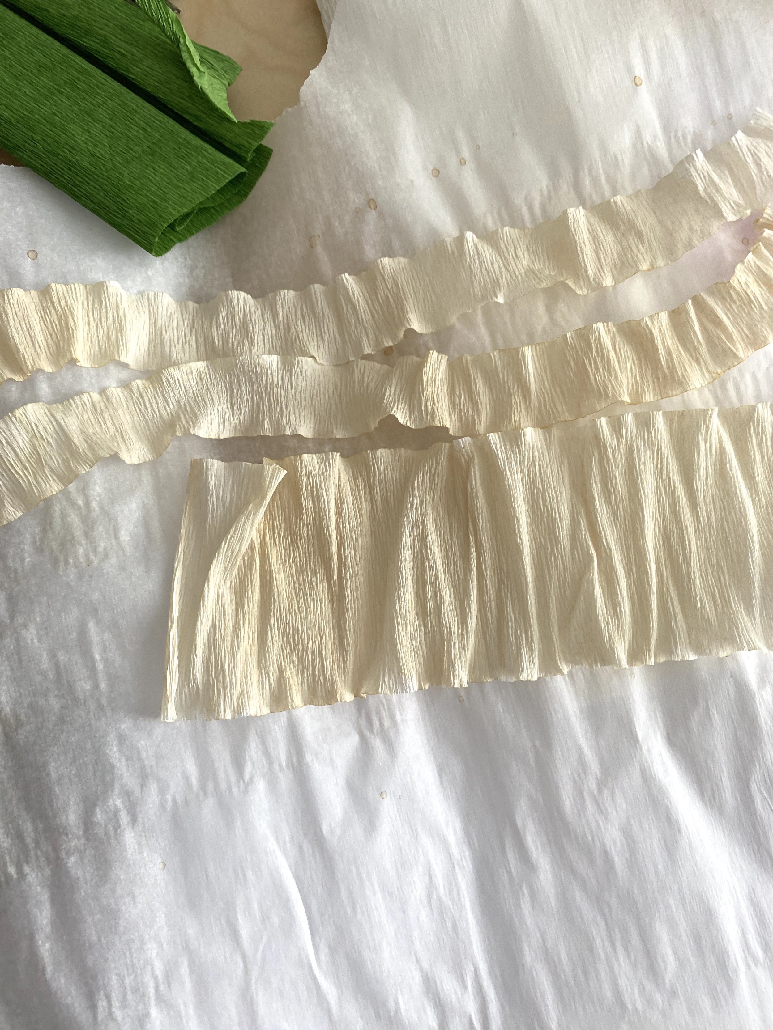
If you have my book, you’ll know that I love using tea to create a light sepia-coloured paper. I use this paper as is to mimic dried or dying leaves and petals. My favourite way is to use it to establish the underlying colour of my paper for colour layering. The effect of adding a bit of sepia to the paper deepens the colour so it’s not a bright-out-of-the-tube colour. There’s absolutely nothing wrong with bright colours! In fact, I love bright colours! But, if you’ve ever looked closely at any flower, they present more than one (or even two!) colours in their petals, and often, there’s either a bit of green streaking or muddiness where the colours mix. Previously, I’ll add the sepia in as a final touch (my favourite way was to use Design Master TintIt in Sepia or by brushing on some Pan Pastel in Bronze). Now, I use tea-water to achieve a similar effect and I find it’s most effectively when I want to wash an entire strip/piece of crepe paper.

Hellebore petal with under layer colours. This paper was painted first, then laminated, then cut and shaped into form.

Hellebore petals with Pan Pastel colouring on top of the under layer.
The lovely thing about tea is that you can easily control lightness/darkness of the tint by simply controlling the amount of water you add and the type of tea to use. I use black tea for stronger colouring and oolong tea for more subtle colouring. I make the tea and adjust how strong (dark) the tea is with water. Then I mix my acrylics in a separate small plastic container. I don’t have use too much acrylic at this time. I usually use acrylic that goes in a tube, but liquid acrylic works too (more on that later). Once I’m happy with the colour, I pour a bit of the tea-water mixture to it. Then I mix and test for colour intensity. If I want a darker value, I add more colour. If I want a lighter value, I add more tea-water. That’s it!

Containers holding a tea-water mixture, and tea-water mixed greens.

Containers holding tea-water mixed pink and white.
This technique works the best when you want to create soft colours - perfect for painting the under layer colour. If you want more intensity - a darker purple for example - use liquid watercolour or liquid acrylic. You can also try using professional-level acrylic paint which has more colour pigment and less filler.
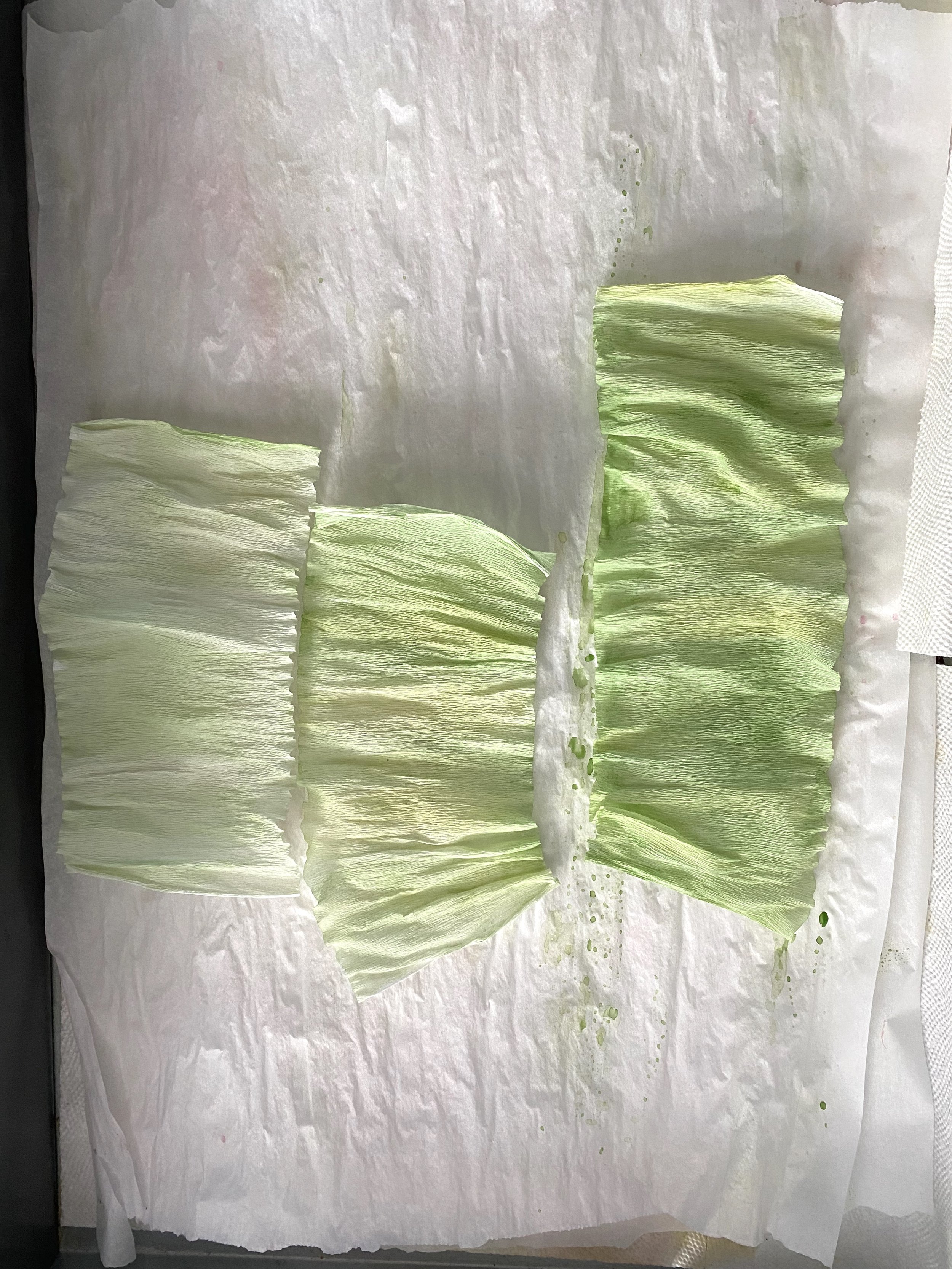
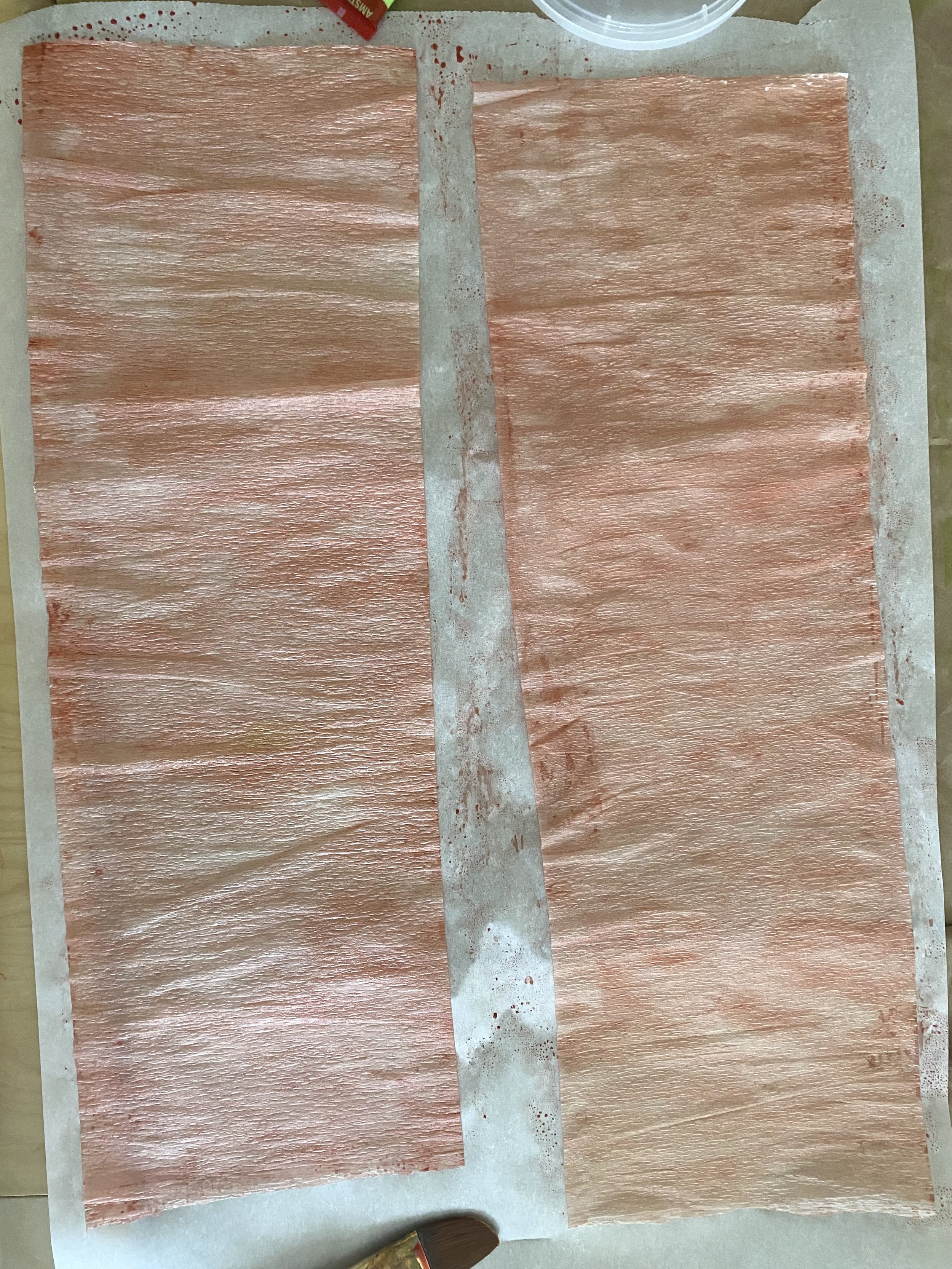
From left: Crepe paper painted with oolong tea/water; painted with black tea/water + green acrylic paint mixture; painted with black tea/water + pink acrylic paint mixture.
Speaking of filler - really this process is just using tea-water as a “base medium” in which it’s “tinted” with colouring. So, while tea-water leans into the reddish browns, you could easily tint your water with white or black to add value or reduce value in the final colour. You could just as easily use white acrylic paint as your base and tint it with different colours to “extend” the colour (I talk about this in my previous blog post, How to use Acrylic Paint and a Medium with Crepe Paper - Part 1). The beauty of using a base medium - whether it’s water or acrylics - is that you can rely on this base to spread the colour extensively and with ease over your crepe paper. Furthermore, if you decide to tint the base medium before using it, all of the other colours you tint with it will have a similar temperature or value or saturation. There is a natural harmony in the colours you make because they all have one colour in common: the tint of the base medium.
The same philosophy works in the cake-baking world with buttercream. Carol Ravagnani has a really great demonstration of how tinting a base medium works using buttercream and using only two colours - yellow and purple - to achieve a harmonious colour palette. Although this video is to promote her new colour course, she shares invaluable insight into how she creates her unique colour palettes for her cakes.
There is, however, a main disadvantage of using water or tea-water as a base medium as opposed to an acrylic medium, and that is the water breaks down the polymer binding between the colour pigments in the acrylic paint. It therefore destabilizes any lightfastness of the paint and is no longer water resistant. It continues to fix itself on the paper without bleeding.
Despite these disadvantages, I find this process an effective way for me to achieve the colouring and effects I’m looking for. While it’s not for everyone, I hope it gives you some ideas.
WANT TO LEARN MORE?
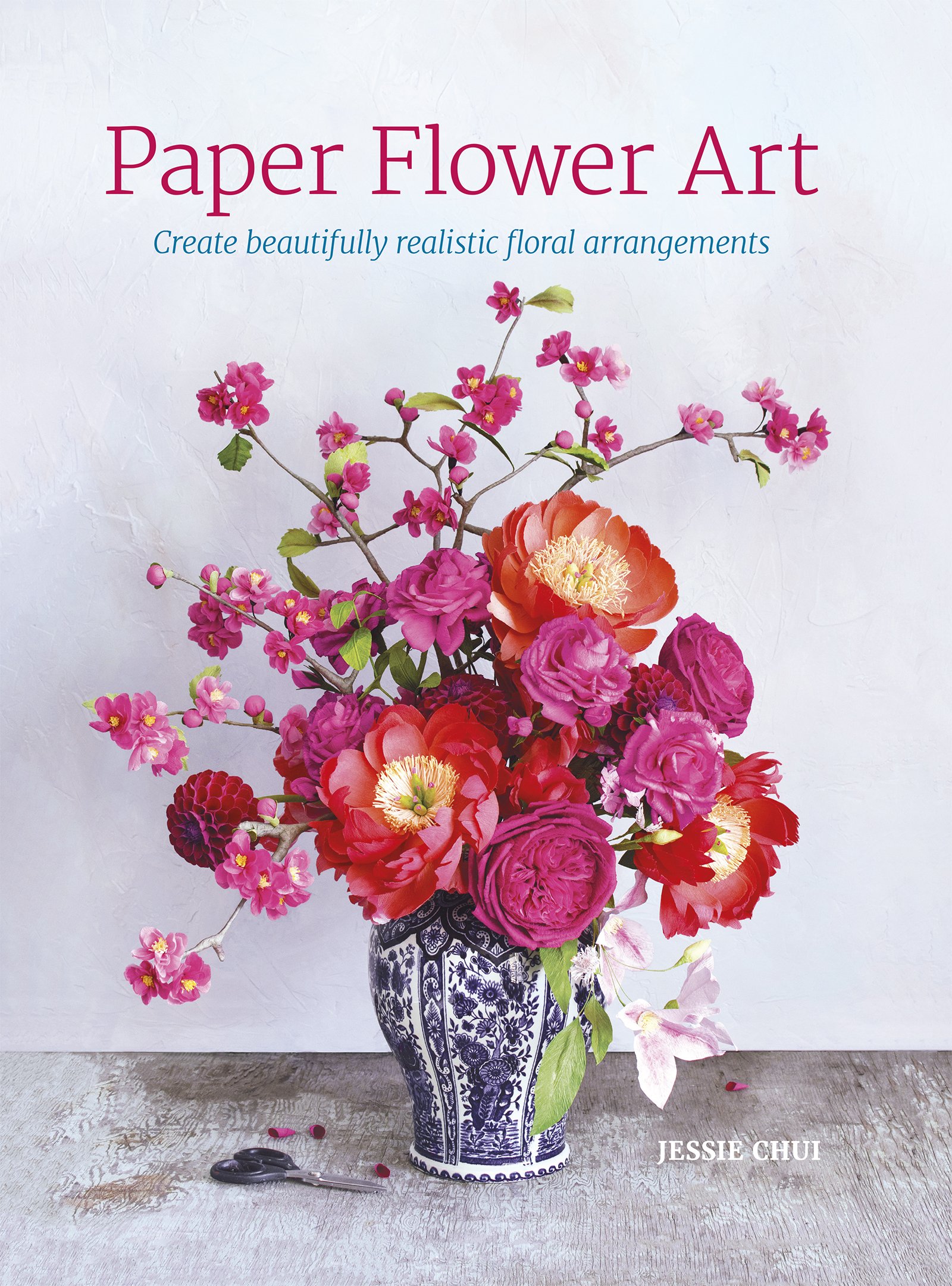
I share how I colour my crepe paper using various mediums before and after putting together the paper flowers in my book, Paper Flower Art (GMC, 2019) (BUY IN HARDCOVER or IN PAPERBACK) or head to my education website, CRAFTED TO BLOOM, for more in-depth learning.