How to use Acrylic Paint with Crepe Paper - Part 1

White Bomb Peony sculptures exclusive to Joliette with foliage painted with acrylic paint.
In this second post of my “Colour My Florals” series, I’m going to share how I paint my crepe paper with acrylic paint to create my crepe paper flower sculptures.
DISCLOSURE — When you click on my affiliate links, I may earn a commission for qualifying purchases made through Amazon.com links in this post. This commission goes directly into the maintenance of my website, the technology that goes into my courses, and my art. Want to know more? Read my AMAZON AFFILIATE DISCLAIMER.
When I first started making floral sculptures, I often washed, dyed and bleached my crepe paper. Essentially I was working with the existing colours of the crepe paper and then manipulating it. It’s a great way of making a whole bunch of unique coloured paper. While I still use these techniques, I slowly began experimenting with watercolours, inks, and acrylic paints. For a long time I used watercolours and watercolour inks to great effect. I tried acrylics and didn’t love it and didn’t use it for some time. Recently I’ve returned to it and discovered I don’t mind it. I even used acrylic paint for the foliage on my white bomb peonies. Now I’m obsessed.
Dyes and watercolour has its colour dye/pigment suspended in a liquid - water - and thus, the colour soaks through the paper and into the fibres. The water blends into each other and creates colours together within the paper easily. I can also get really lovely muddy effects that I love so well. It can also maintain the translucency of some of the paper which softens the look of the paper and petals.
Acrylic paint is different. Pigment is suspended in an acrylic polymer emulsion. The solution sits on top of the paper and creates a plastic film around the paper thereby reducing translucency. It doesn’t spread easily on crepe paper without the use of an acrylic medium. After painting and the paper is stretched, you tend to see uncoloured line appear. I always have to do touch-ups to my painting once my flower is finished.
How to address the unique qualities of crepe paper and acrylic paint
Crepe paper is different from other types of paper because it has grain lines. It’s not manufactured or processed as a medium to paint on, which is why it comes in such a beautiful array of colours. They’re teethy - which make them perfect for pastels, although not as ideal for other mediums where you have to run a brush over it.
German crepe paper feels coarse and paint brushes drag on its surface. When painting, the doublette/double-sided crepe paper is preferable to the fine crepe paper though as the latter tears when wet or when something drags across its surface. The grain lines are fine enough for paint to seep between. The heavy florist crepe paper can be used when completely stretched to reduce the severity of the grain lines.
The heavier Italian crepe paper (like the 180g and 90g), when the grain line is completely stretched out, is less teethy, but there is still drag on its surface. Italian crepe paper is not as absorbent than the German crepe paper, so acrylic paint actually sits better on it compared with watercolours because painting it doesn’t rely on the pigment being absorbed into the paper. The finer 60g crepe paper can be painted on if it’s been laminated by white or spray glue to create a sturdier paper.
One way to reduce the teethy-ness of the paper is to try to make the application of the paint smoother. I like to do this by using acrylic paint that is (1) in more of a liquid form like Golden Fluid Acrylics or Golden High Flow Acrylics, or (2) adding a medium to the acrylic paint for a smoother application and to extend the colour. I do not use a heavy body acrylic directly on the paper.

I used a mix of artist grade and professional grade paints and inks for my peony leaves.
What mediums I use with my acrylic paint on crepe paper
There are a number of different mediums you can use with your acrylic paint. There are mediums that extend the paint colour (like a matte or gloss medium, pouring medium, gloss medium) or drying time (like a slow dry medium); or ones that change the texture of the paint (like modeling paste).
You can also use any colour of crepe paper you want, although keep in mind that with glazes (or thin layers of matte medium, although less so), you will be able to see the colour of the crepe paper under the glaze. Consider how this might be used to great effect, or not.
MATTE MEDIUM
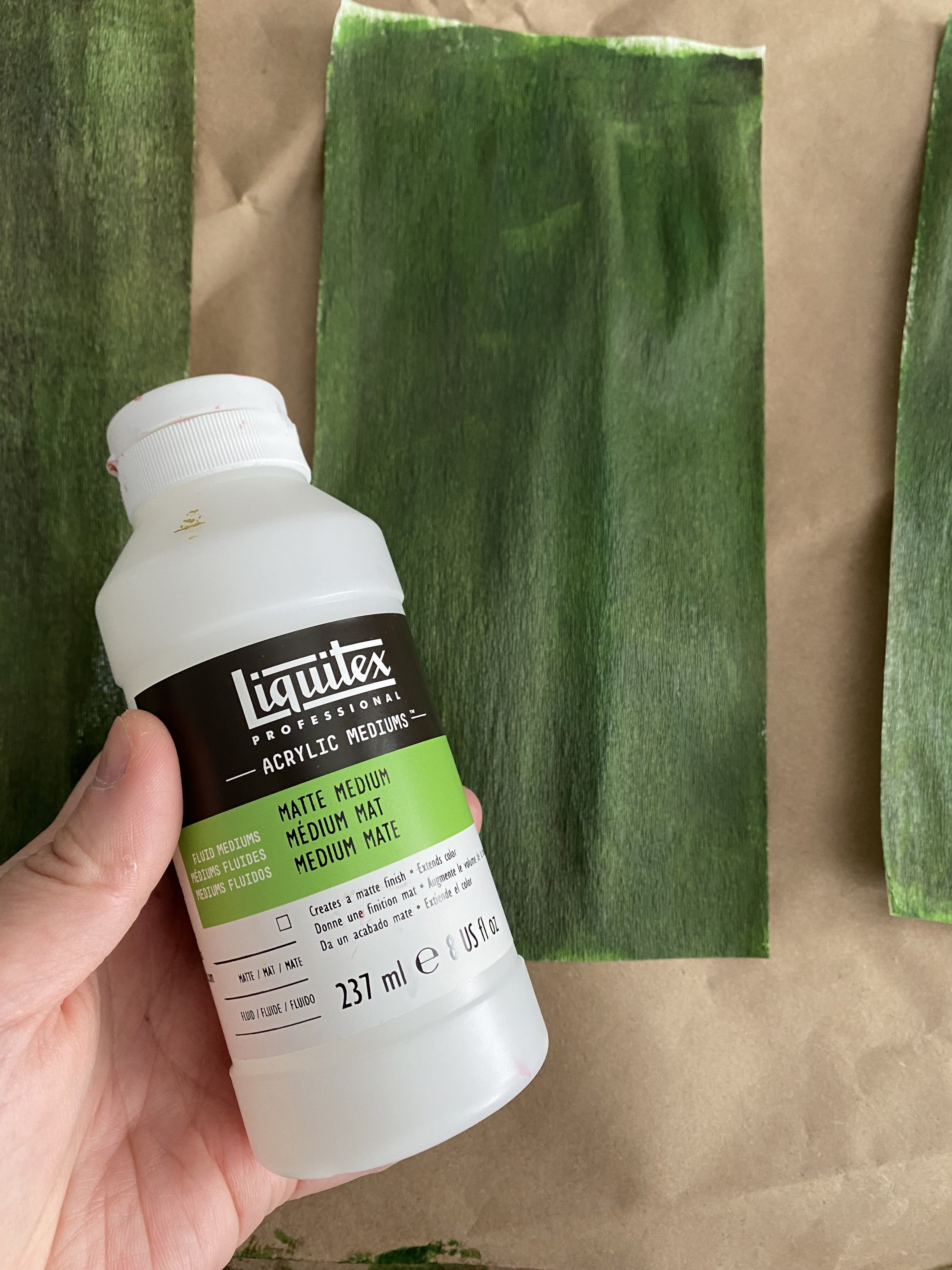
Depending on the brand, there are slight differences in how this type of medium is named. It is essentially the acrylic polymer emulsion that is used in acrylic paint. It comes in white but dries clear and when tinted with the acrylic paint/ink, it will extend the colour. It’s ideal when you have high pigment artist-grade paint to extend the colour in such a way that it still maintains similar high pigment. If using a less high pigment paint, it can spread the pigment out so you would get a lighter version of said colour.
The medium comes in matte, gloss, and even satin. It can be thick or fluid depending on which one you buy. For example, Golden offers a Fluid Matte Medium, a regular Matte Medium, and a gloss medium. Here I’m using Liquitex matte medium which comes in a fluid form. I do recommend using the more fluid consistency of matte medium if possible.
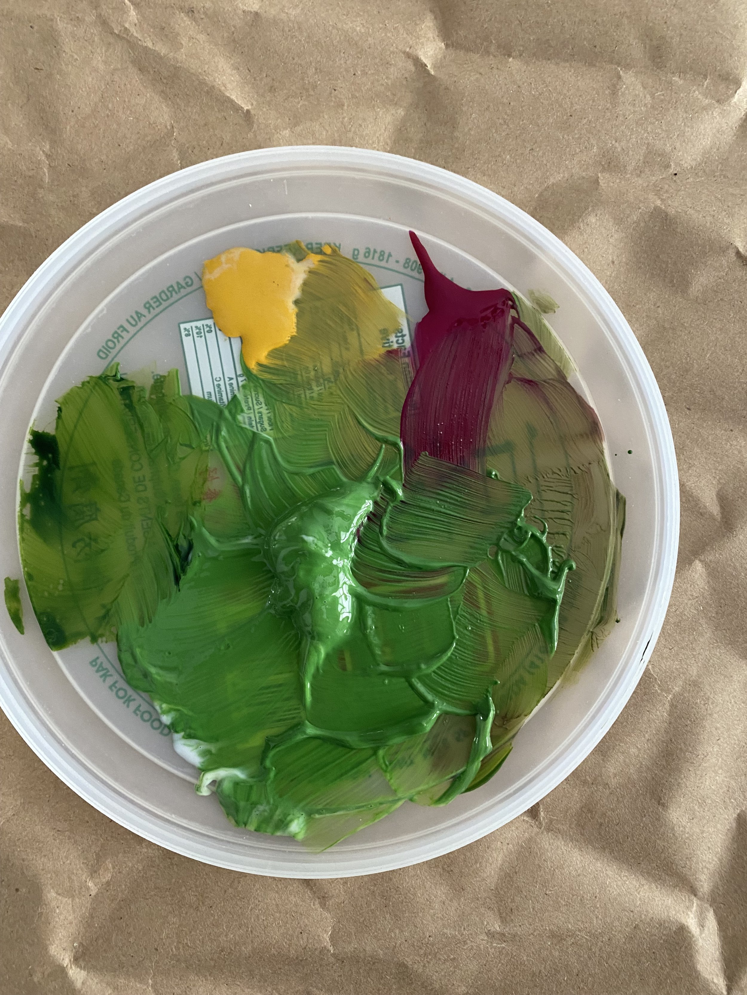
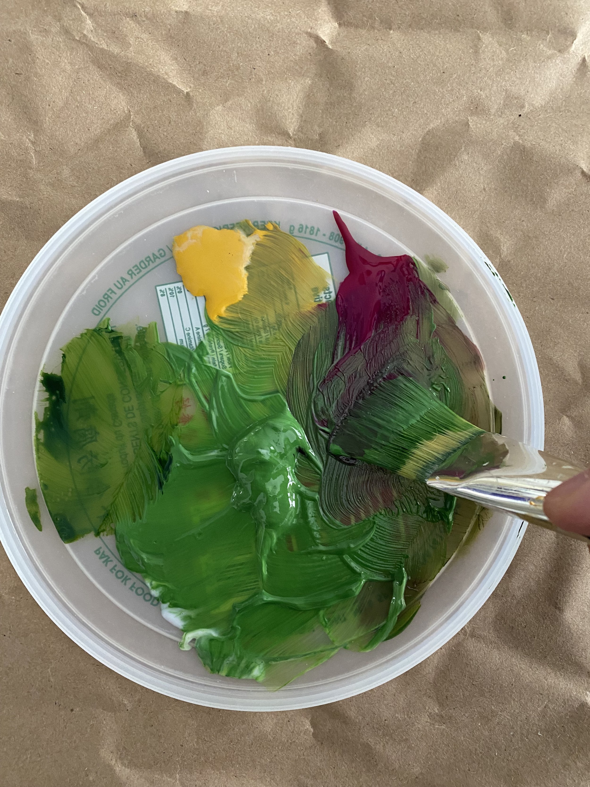
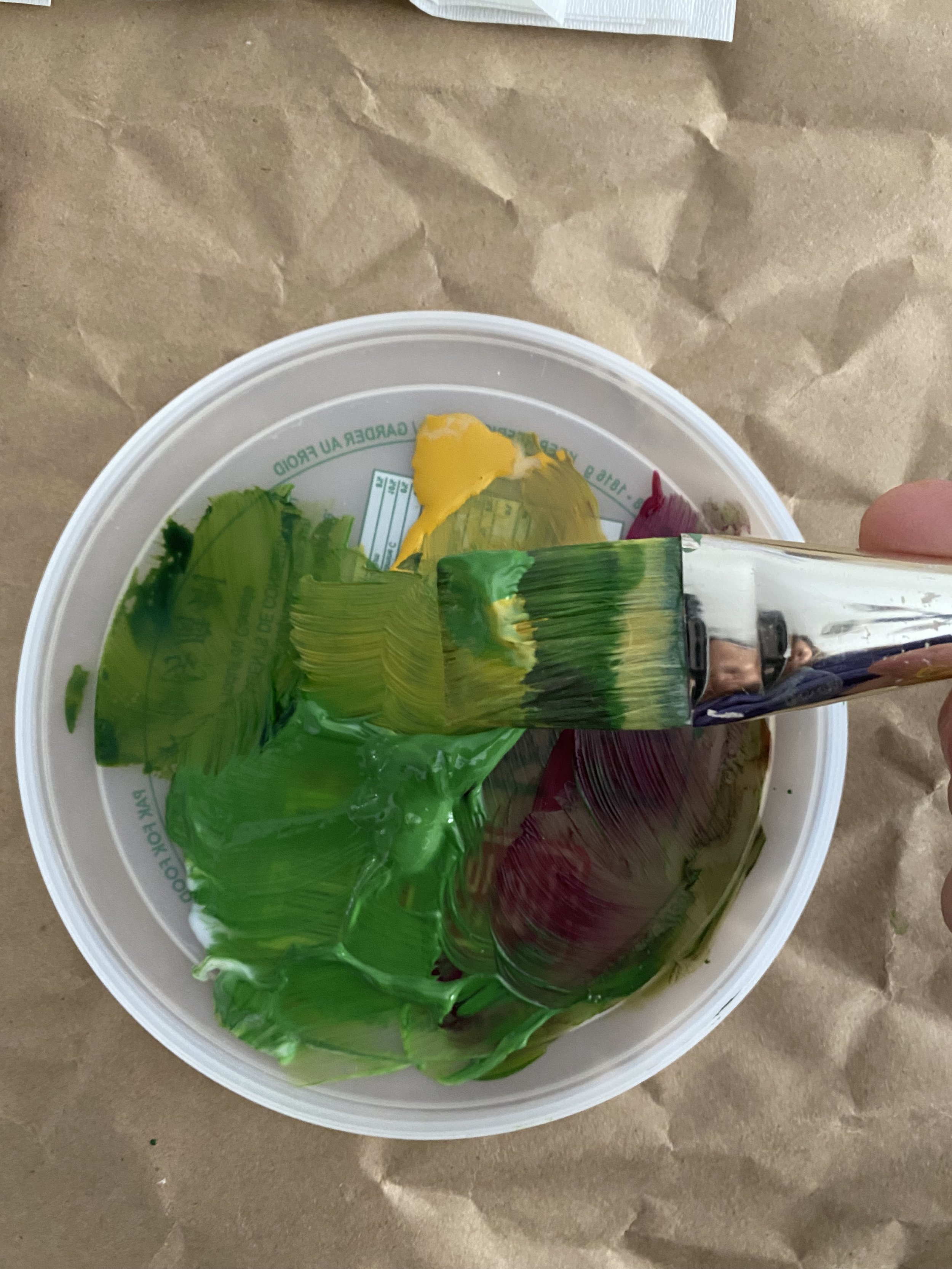
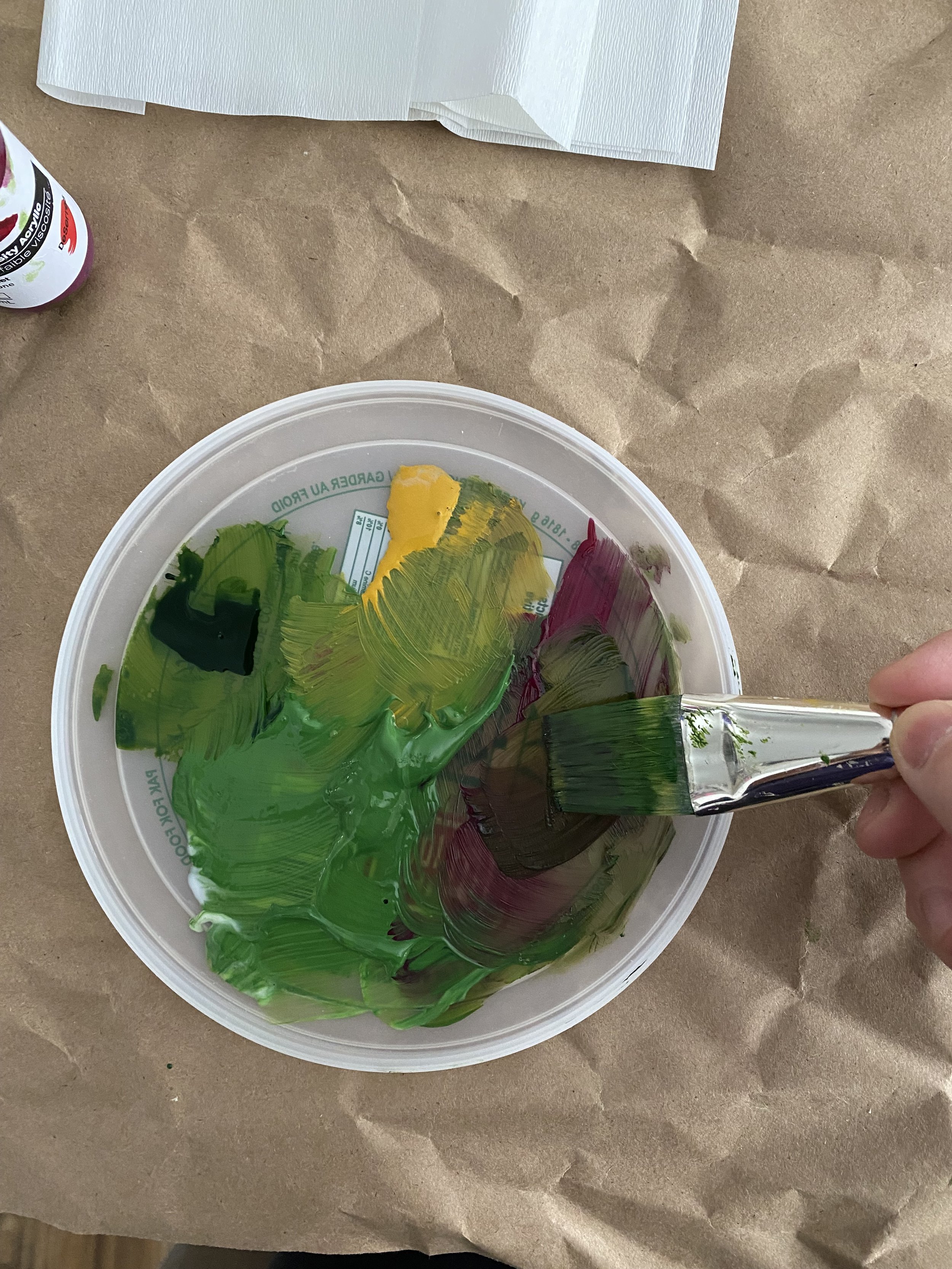
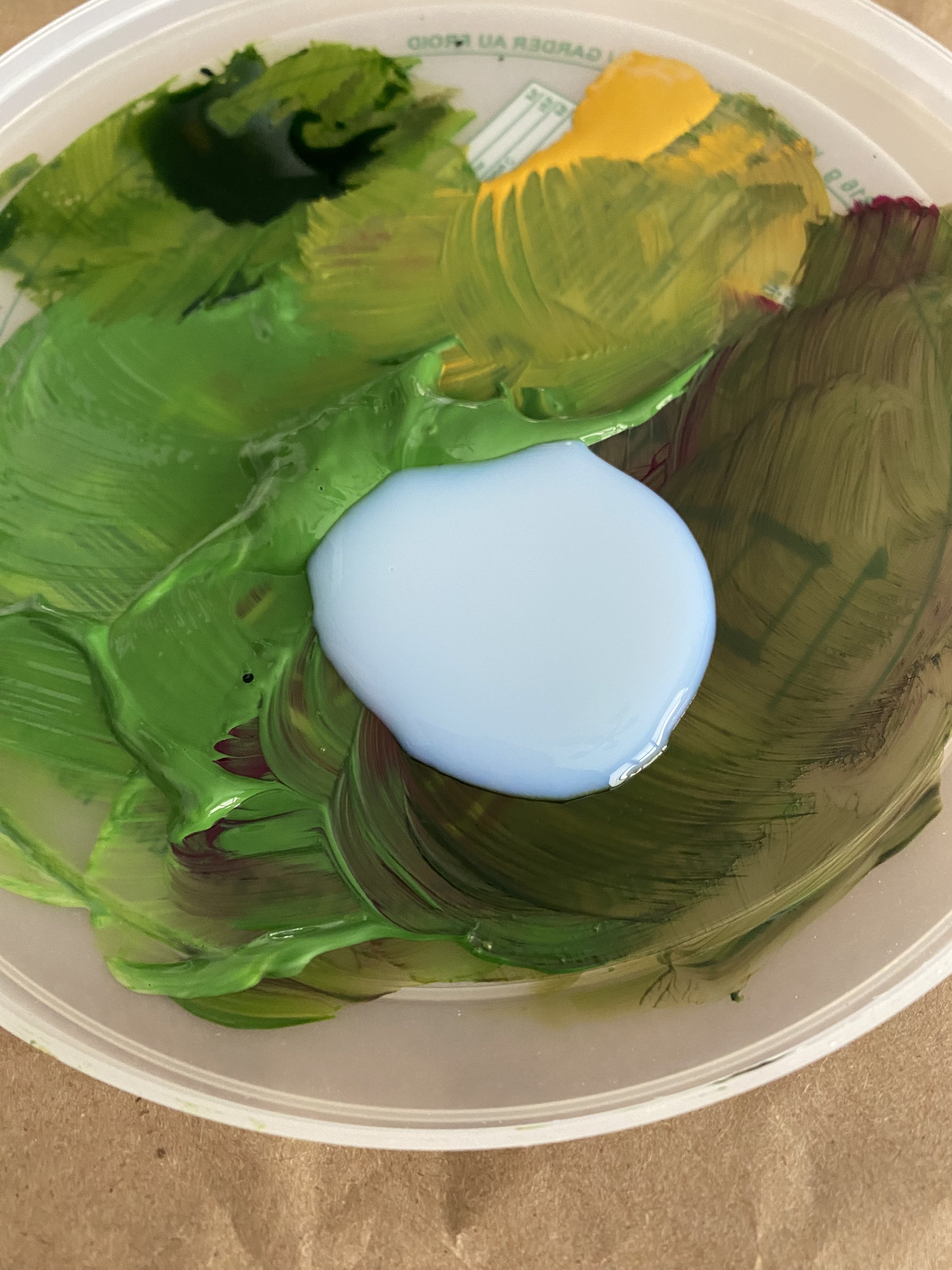
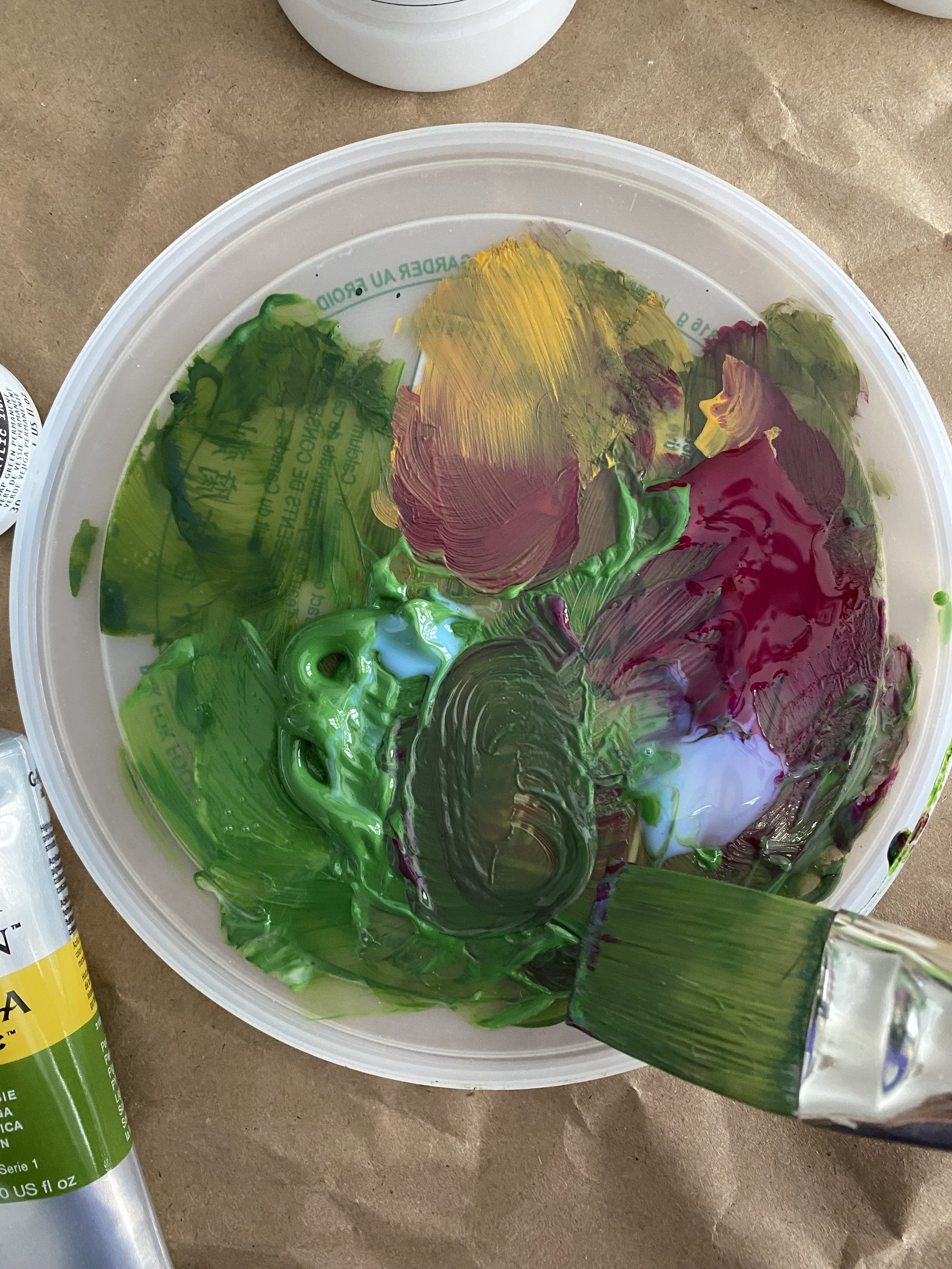
When using this type of medium, you’ll want to mix the colours on your palette first, then add the medium and then further mix with a palette knife. I’m not that picky, so instead of doing this again for a second colour, I’ll mix a second colour with no medium and mix that into parts of the pre-mixed colour as well.
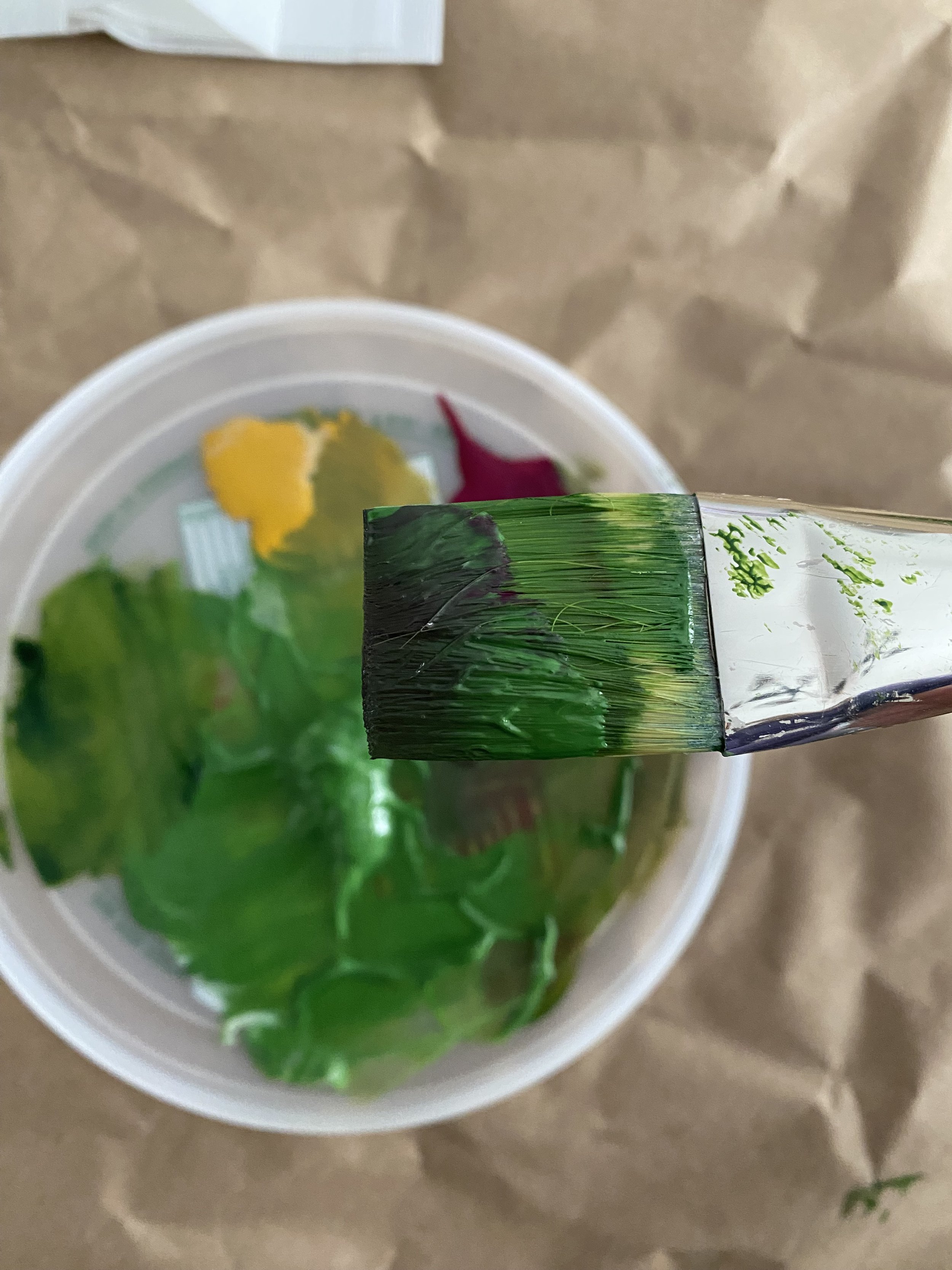
Then, apply the paint by simply drawing it across the surface of the crepe paper.
I find that the medium helps spread the paint on the teethy crepe paper much better than without. In fact, once you’ve painted the entire crepe paper, any subsequent painting you do on top will be much easier. It’s like putting a base layer of gesso on canvas.
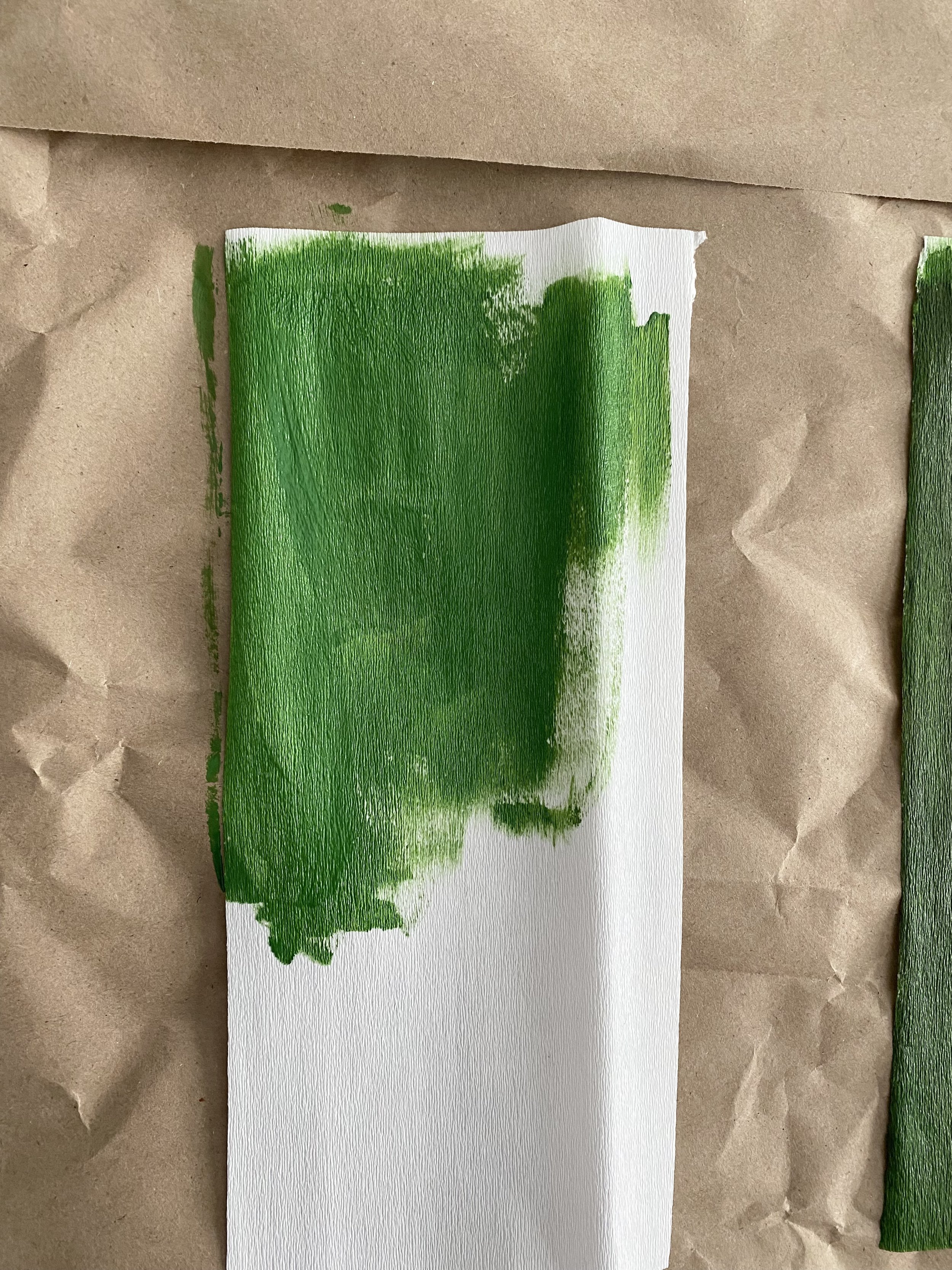
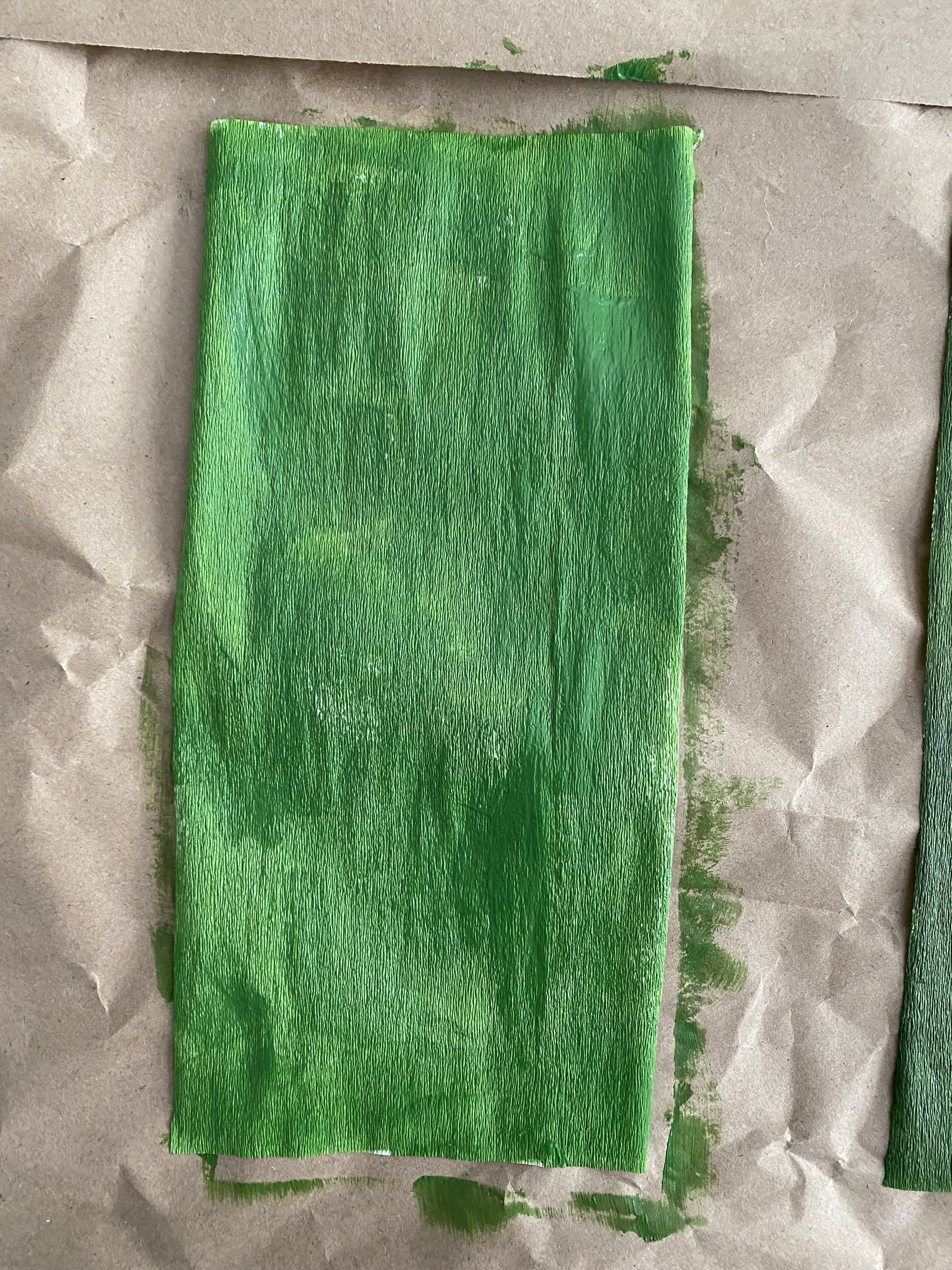
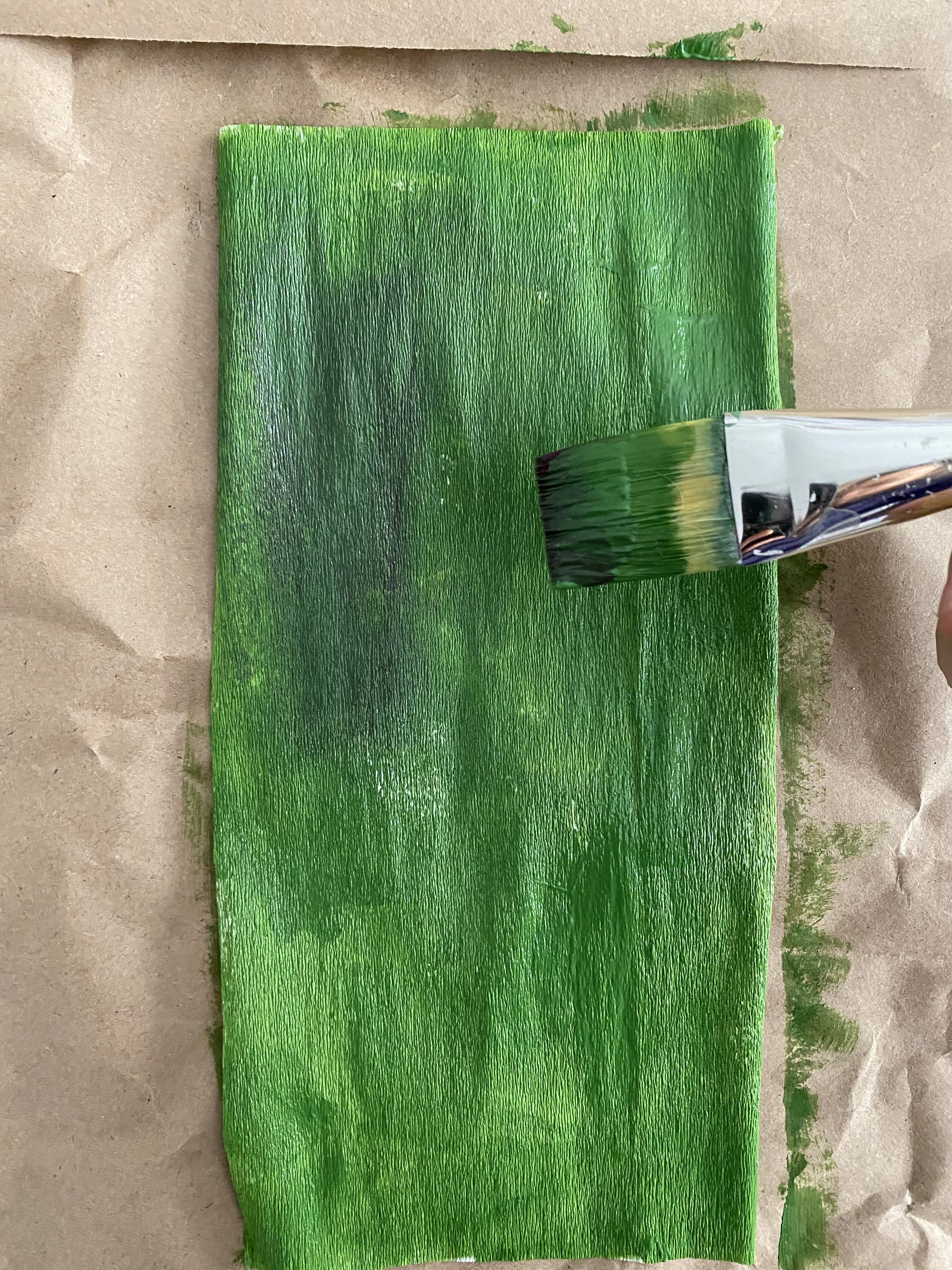
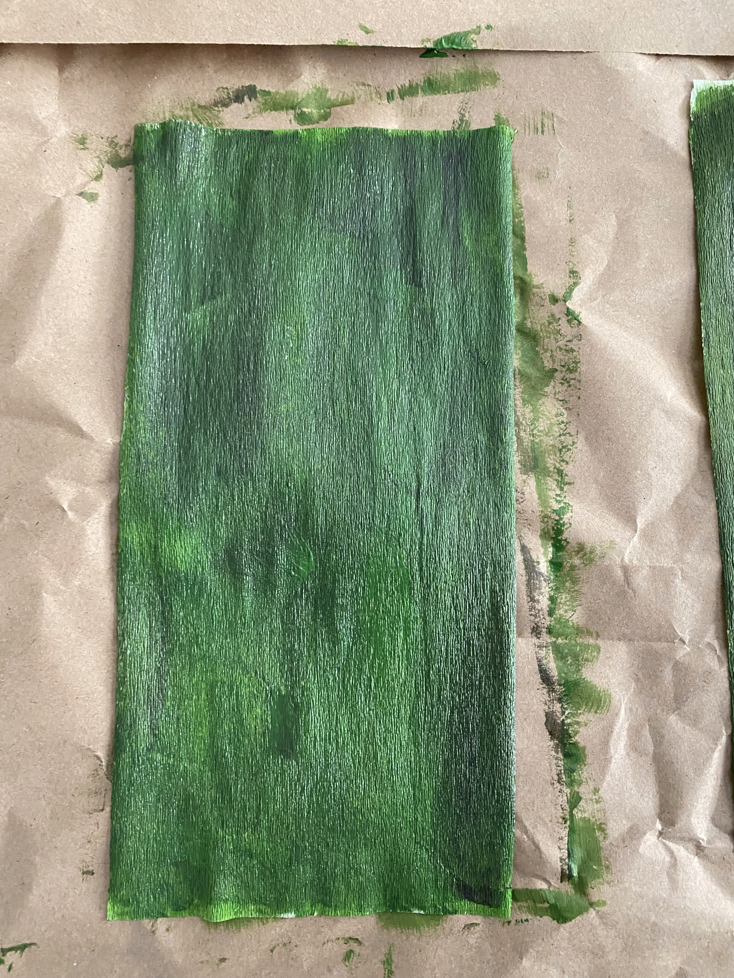
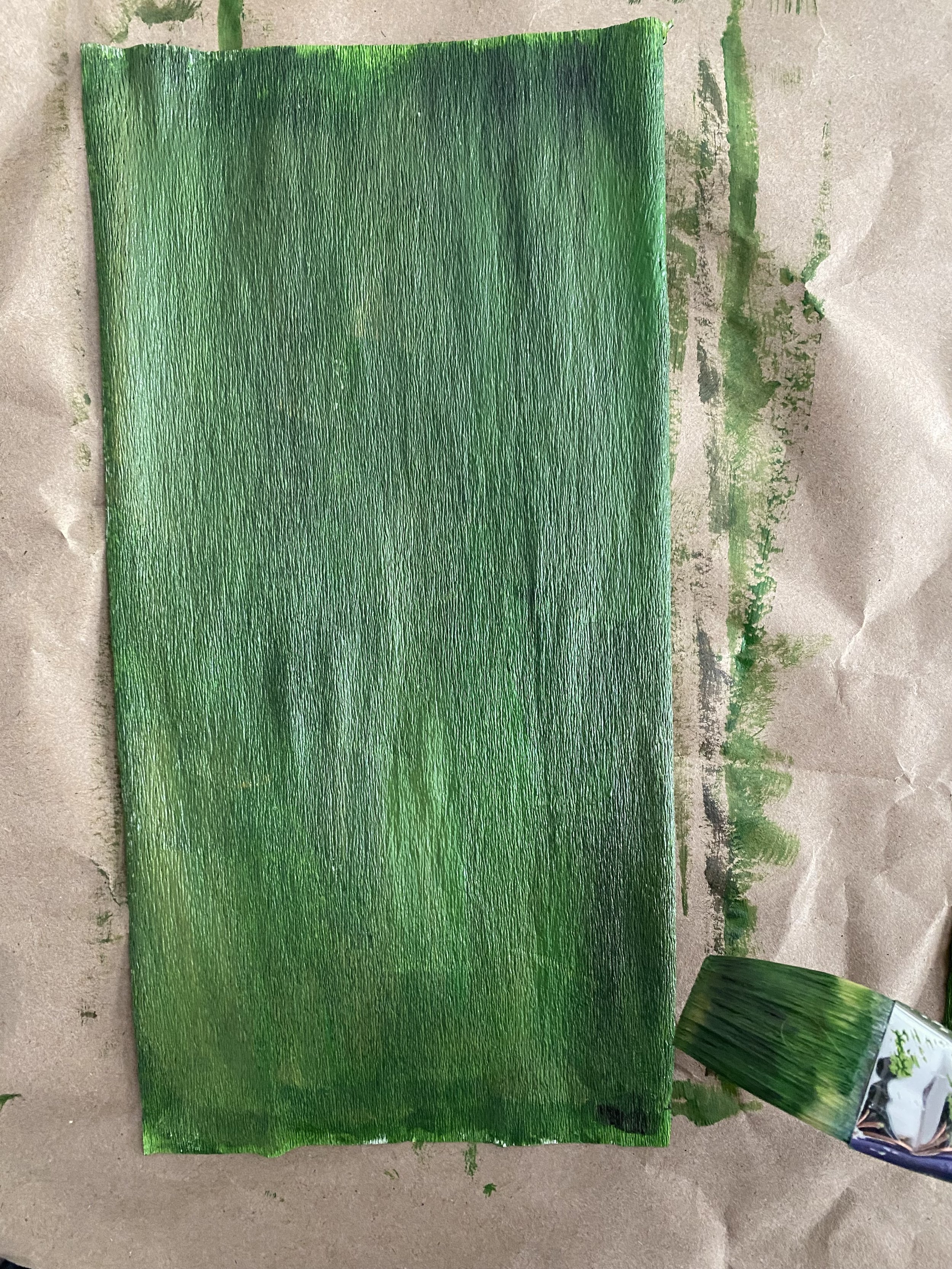
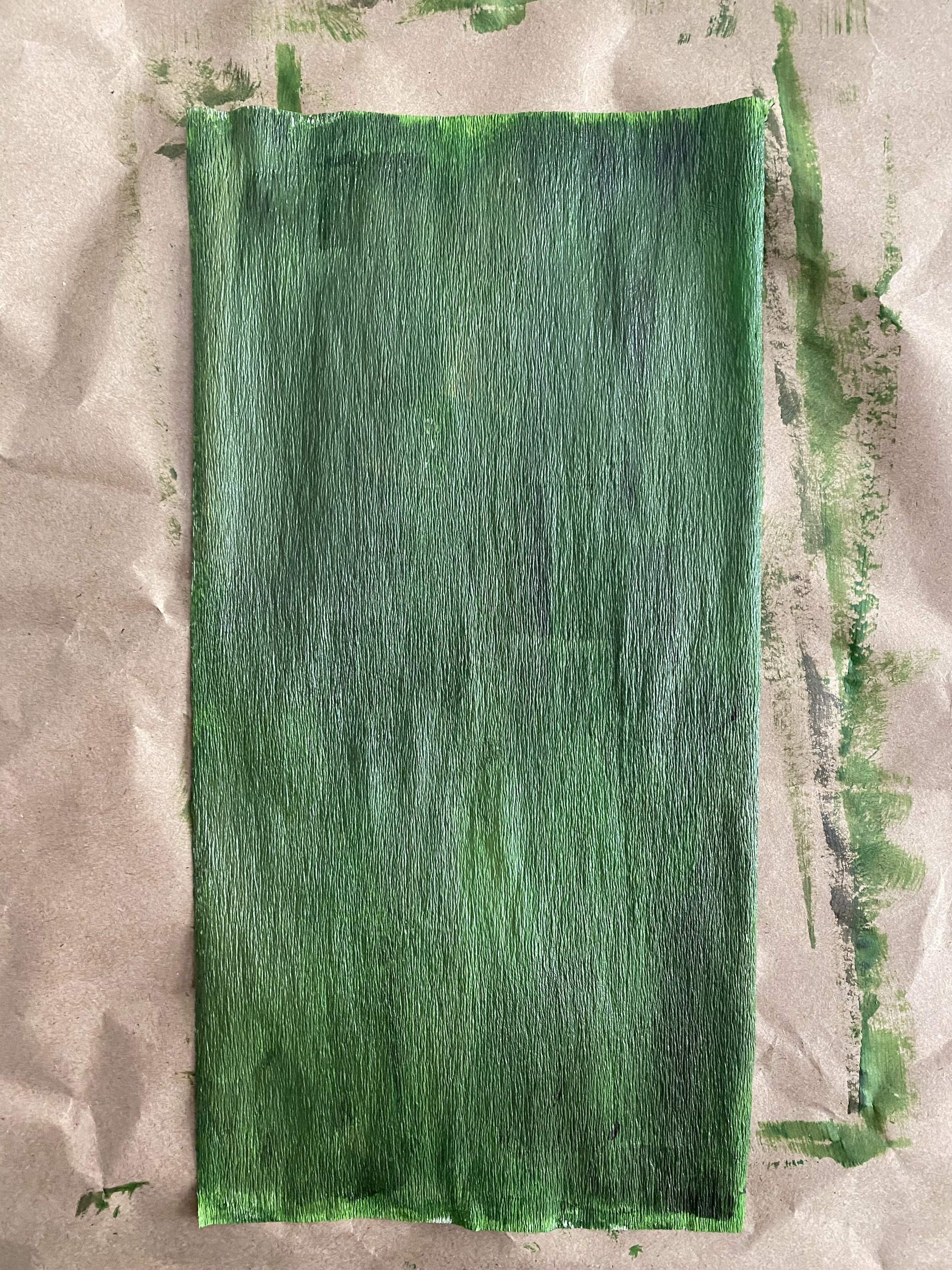
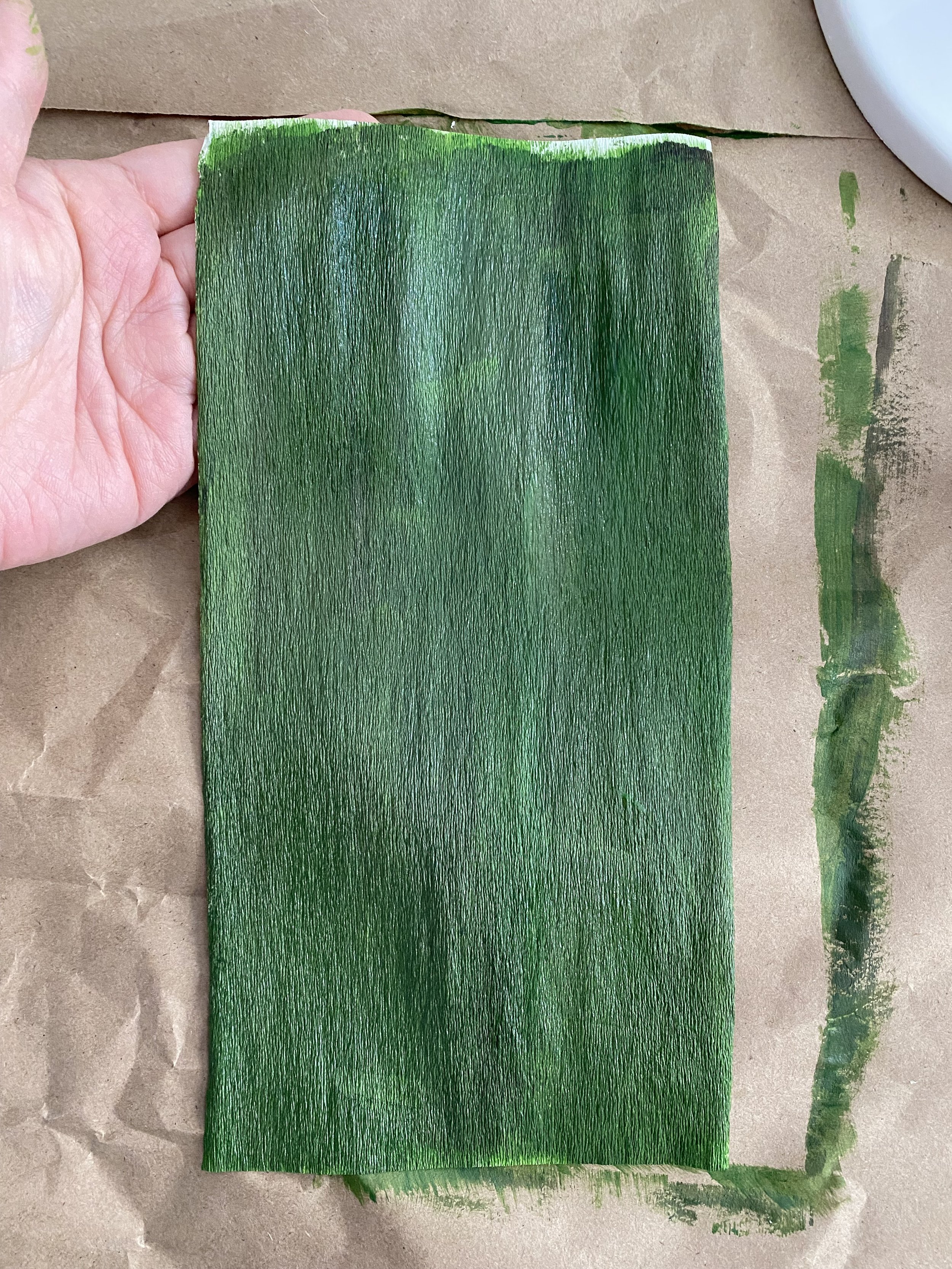
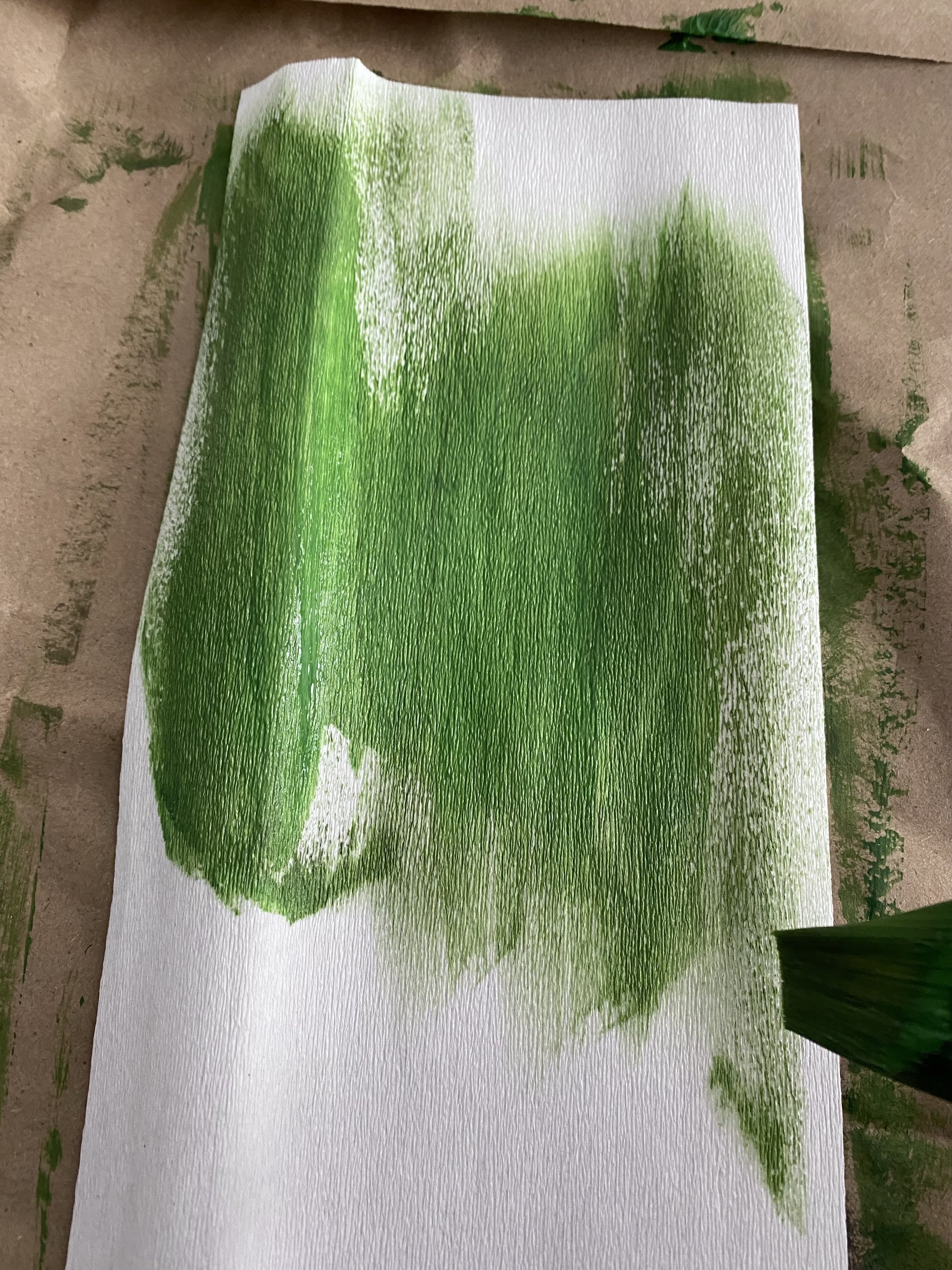
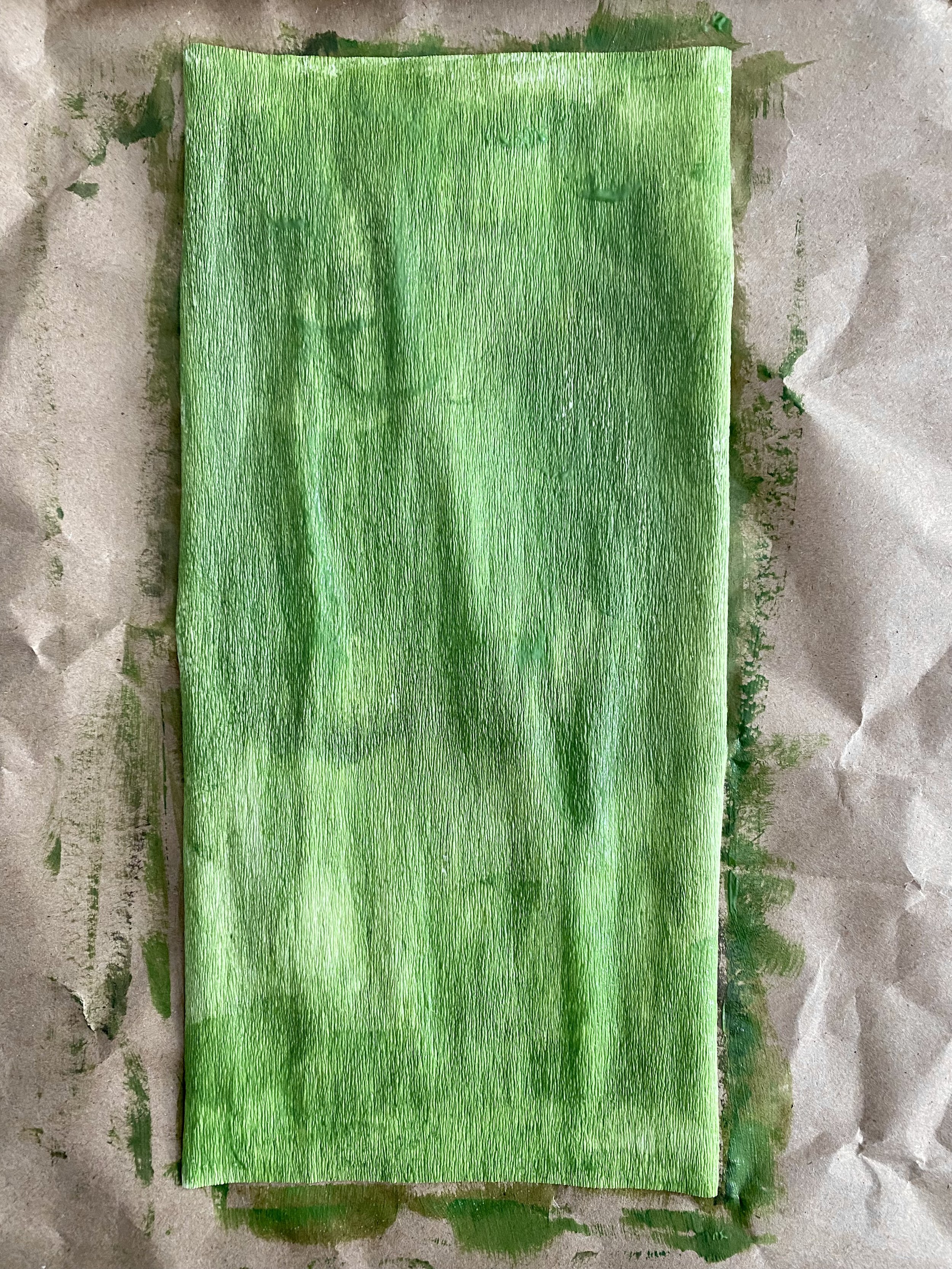
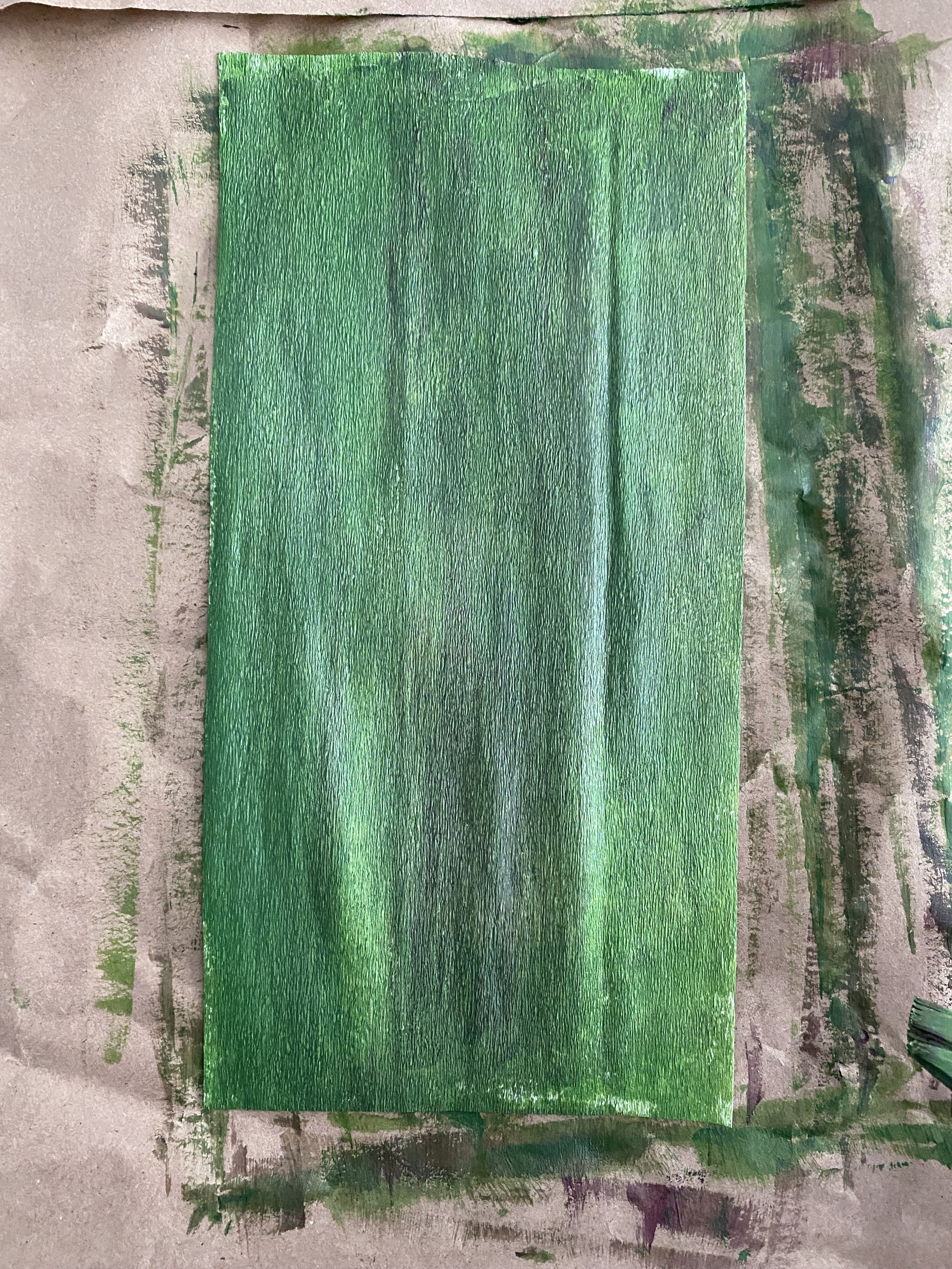
Above: Photos of each layer of colour I painted on the crepe paper using the matte medium
Keep in mind you’ll want to push the paint in between the grain lines so less of it shows when the paper is stretched later on. Also keep in mind that if you layer too much on top, it will hinder the stretch of the grain lines while shaping and you’ll end up with a really stiff piece of crepe paper.
In the image below, you can see that the colours blend into each other beautifully, however, there’s not much depth that can be achieved with layering. In order to get this dark green, I mixed the colour in my palette before applying on the paper. The acrylic paint had great coverage and I couldn’t use it the same way as a glaze because any layer of paint I put on top would cover the bottom. Granted, there may be colours that are more transparent that you could work with that would perhaps give you more of a layering effect.
Side note: If you really like the matte and opaque effect, try painting your crepe paper with furniture paint. I experimented with my favourite non-toxic, water-based furniture paint, Fusion Mineral paint. The consistency is similar to a pouring medium for acrylics. I use these paints on my large canvas backgrounds because their coverage is so amazing. They cover a fair bit of real estate so I thought I would try them on crepe paper. I thought they would be perfect for foliage by painting a whole swath of paper and then cutting leaves from them. The paint was just as I expected - smooth and had coverage. However, it was entirely too opaque for me. It was nice and matte though, while acrylic tends to have a slight sheen.
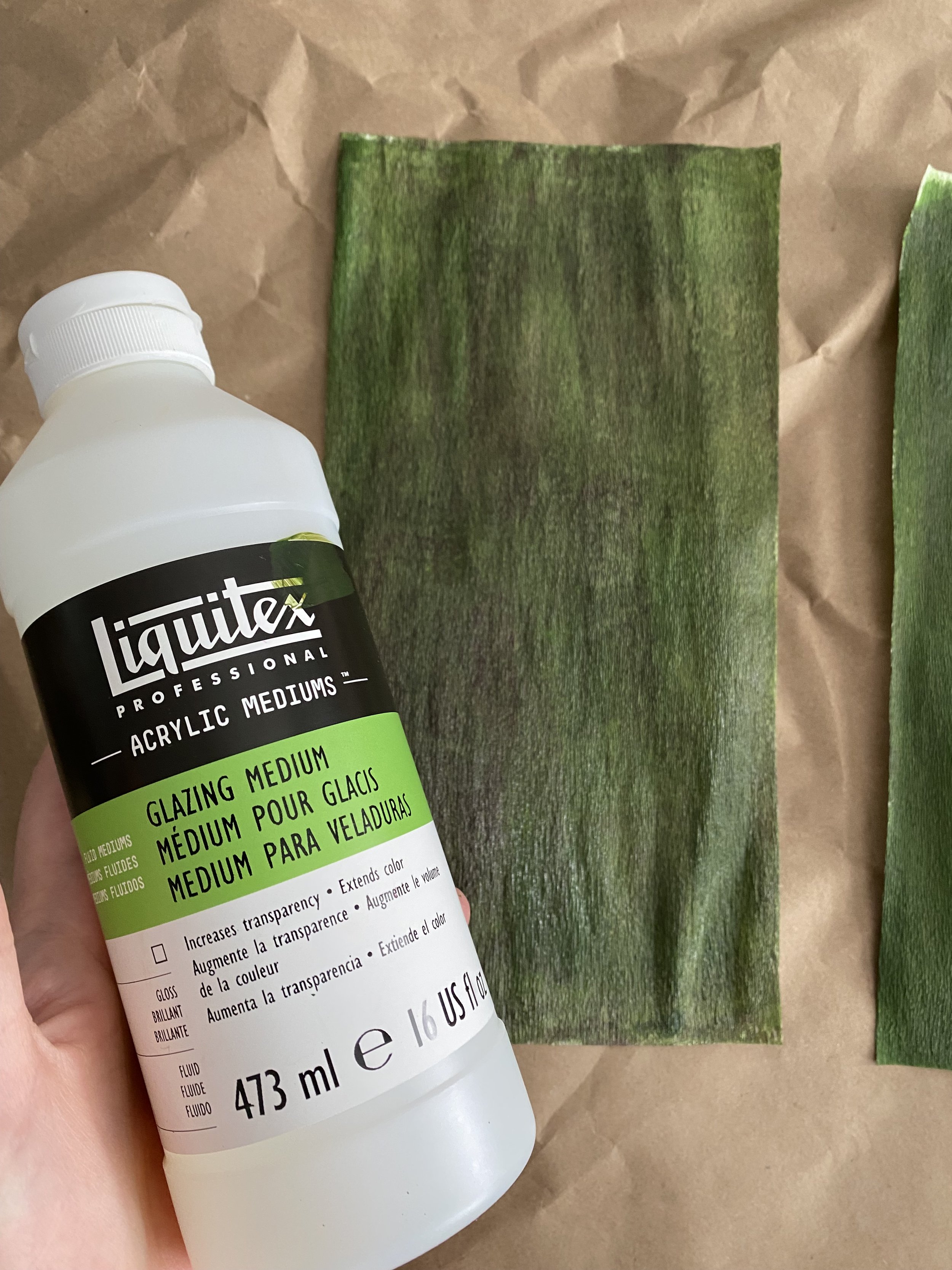
GLAZING MEDIUM
My favourite way of painting with acrylic paint is using a glazing medium, which allows for layering of colours creating more depth and dimension. Here I’m using Liquitex Glazing Medium.
Glazing is a technique that’s been used for hundreds of years. The most famous painting in the world - the Mona Lisa - was painted using a glazing technique perfected by Leonardo da Vinci.
The technique involves layering thin coats of colours on top of each other. The layers are so thin that it allows light to shine through all of the layers, and the resulting colour waves that return to our eyes are optically mixed together. We see the colour - green - that results from the combination of a layer of yellow and a layer of blue, not simply two layers together.
By layering, I can get very subtle effects on the paper. To achieve the colour you want, you don’t necessarily have to mix the colour together on your palette. Instead, you can shift the colours by how they appear to your eyes by directly working on the paper. So by layering a complimentary colour on top - say a pink on top of a green - you can create a dark green without actually mixing the colour. The cool thing is when the light hits the colours, it offers that subtle translucency and dimension that a matter medium just cannot.
The other trick I like to use is to use a white crepe paper as the base. When a glaze is applied on top, the light goes through the glaze to the white background, and creates a luminosity that you can’t achieve by just applying a highlight colour. Strategically leaving bits and pieces of the paper with areas of more layering and less layering can really create beautiful and unexpected areas of highlights and shadows.
I’m by no means an expert at glazing - in fact I admit that I just go with the flow more than anything. I’m 100% sure there is more technique to it than I’ve described and how I’m applying them.
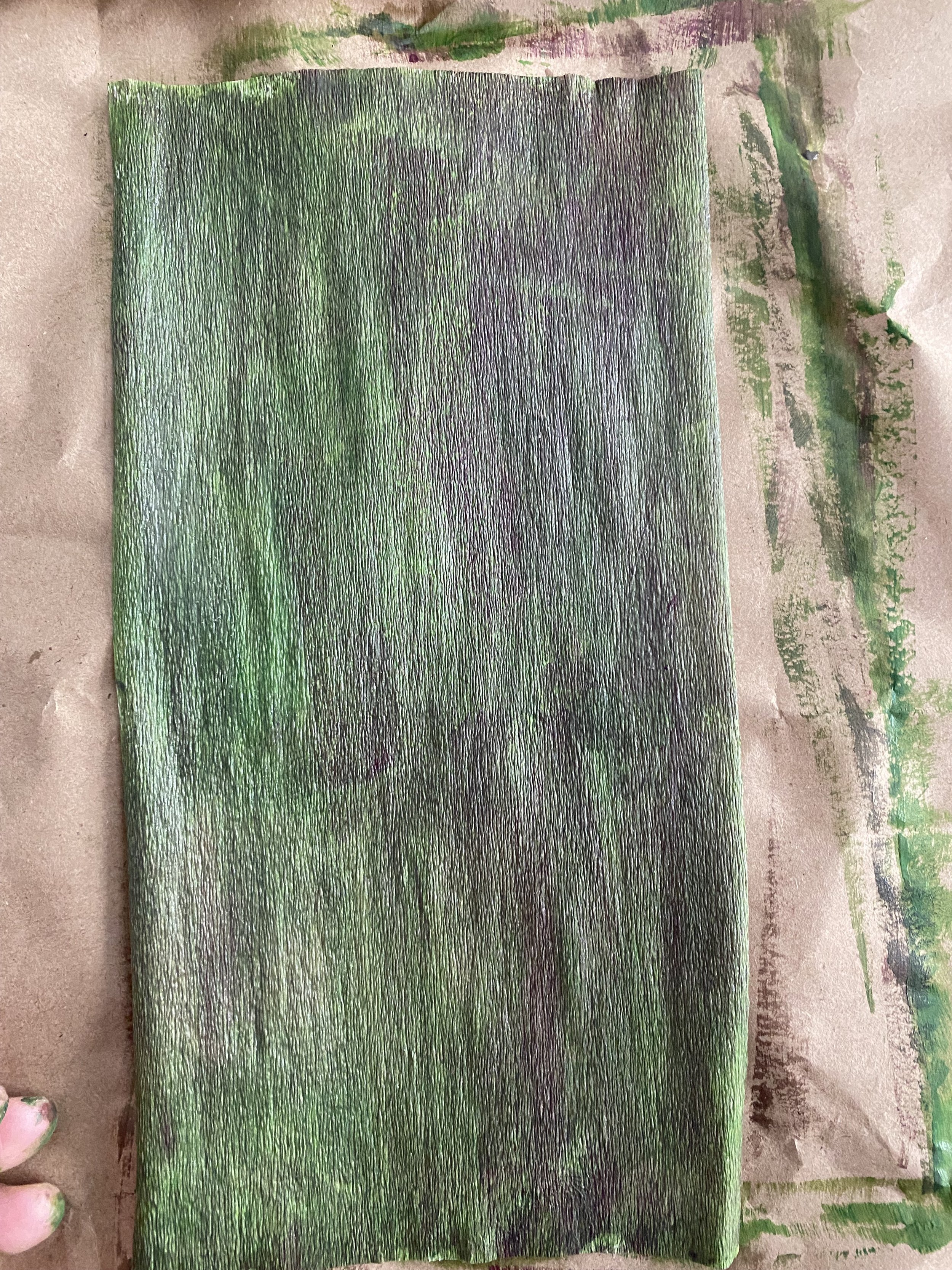
Above: Photos of some of the layers of colour I painted on the crepe paper using the glazing medium
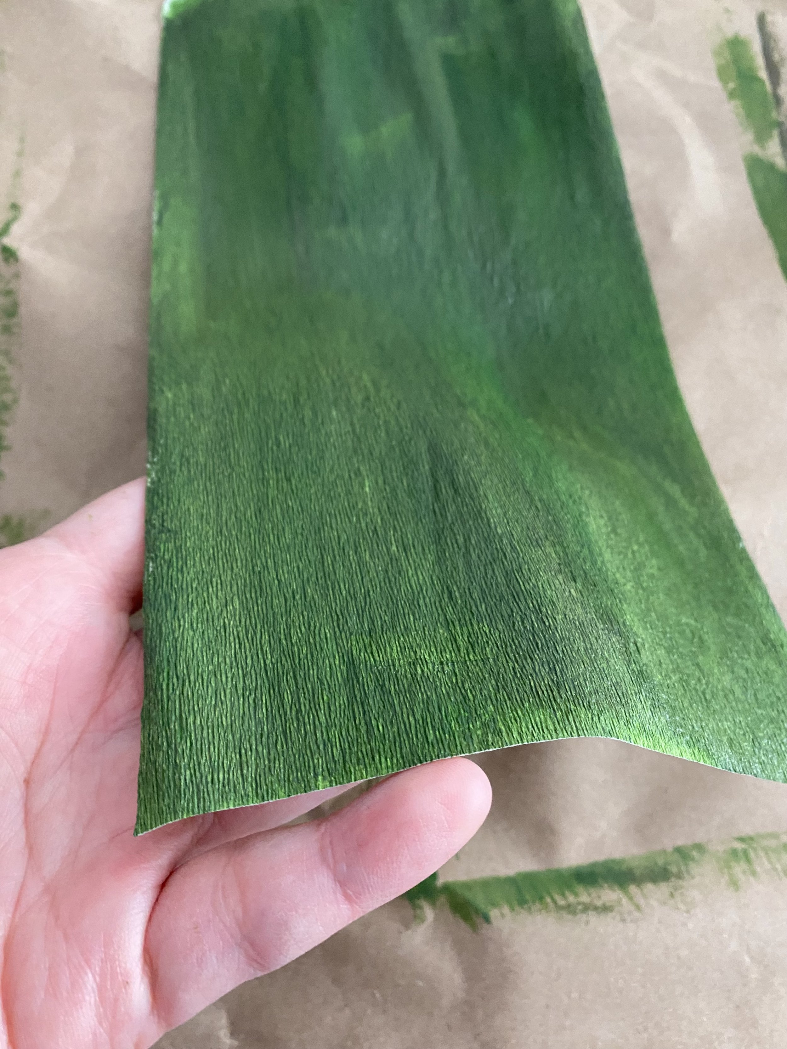
In the pictures below, I’ve used a glazing medium to extend my acrylic paint. You can clearly see the different colours layering on top of each other, with areas with less layering glowing and transmitting more light back to your eyes. The dark patch you see on the right side of the paper is a quinacidone violet layered on top of a green. It doesn’t look pink - does it?
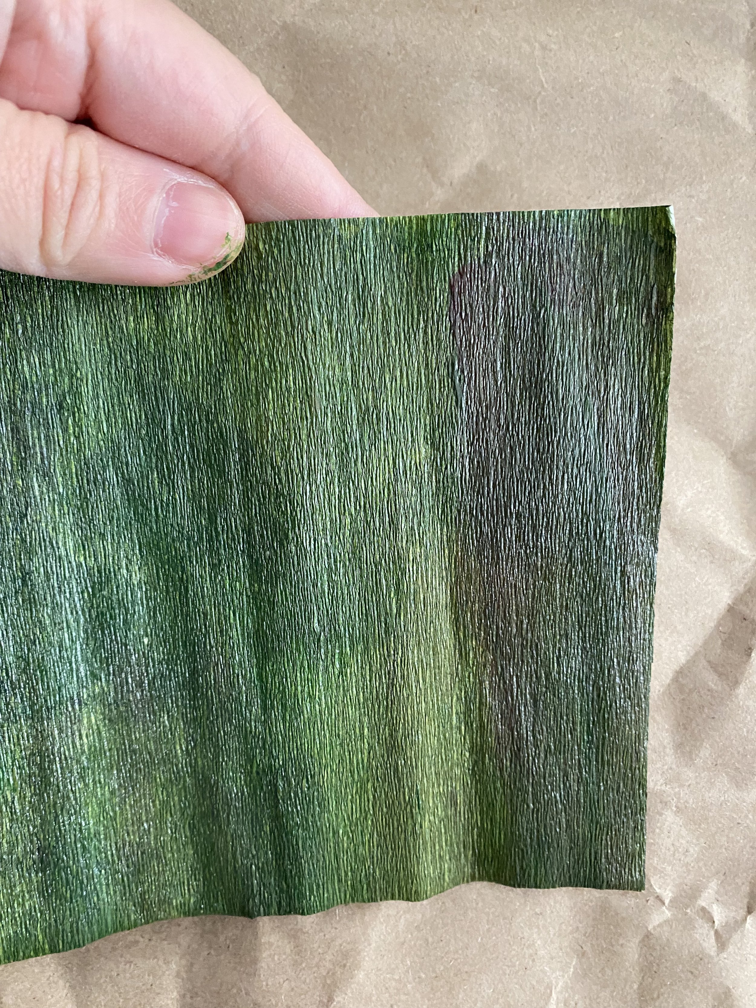
Above: Result of painting white doublette/double-sided crepe paper with acrylic mixed in a glaze medium
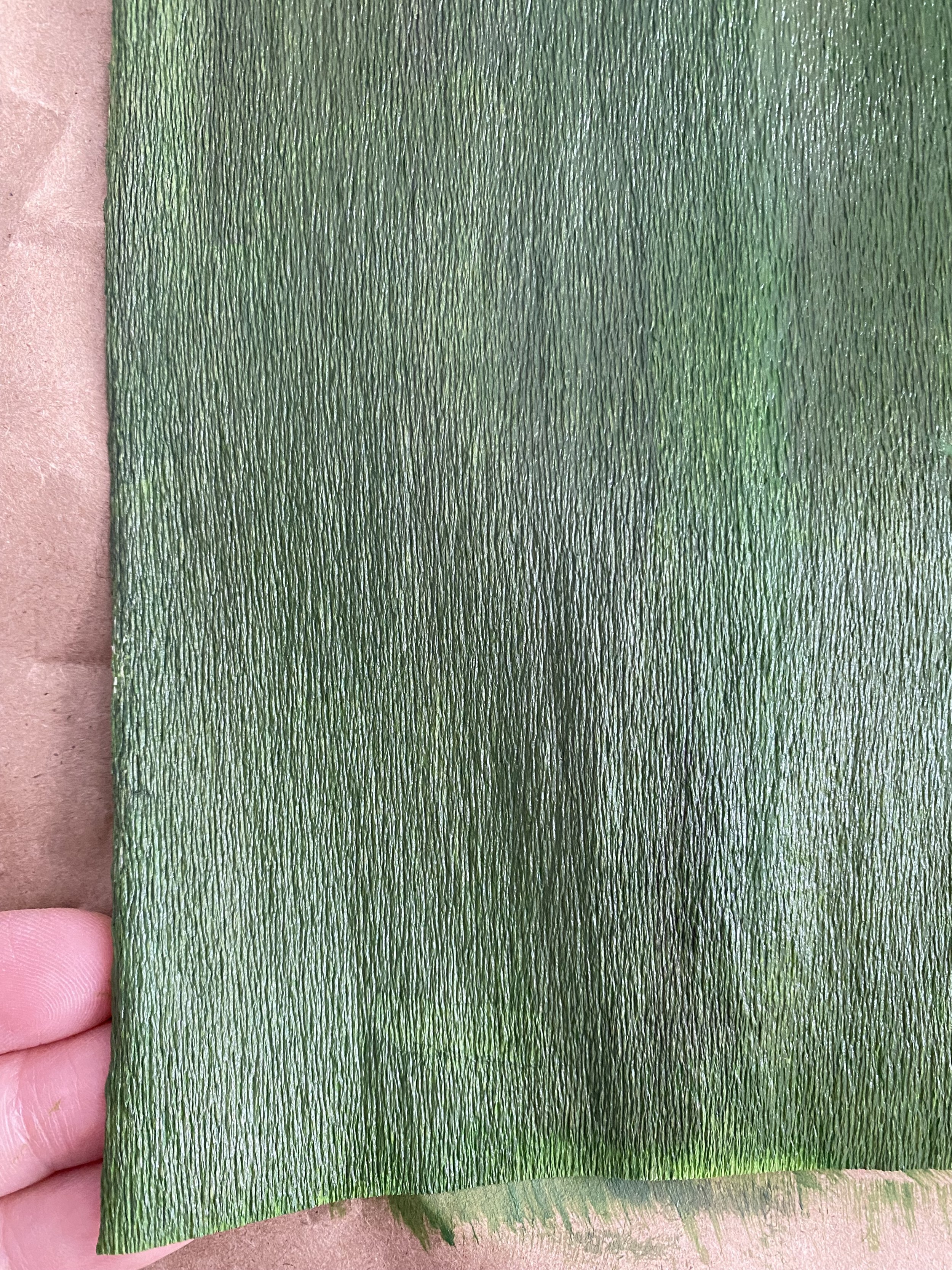
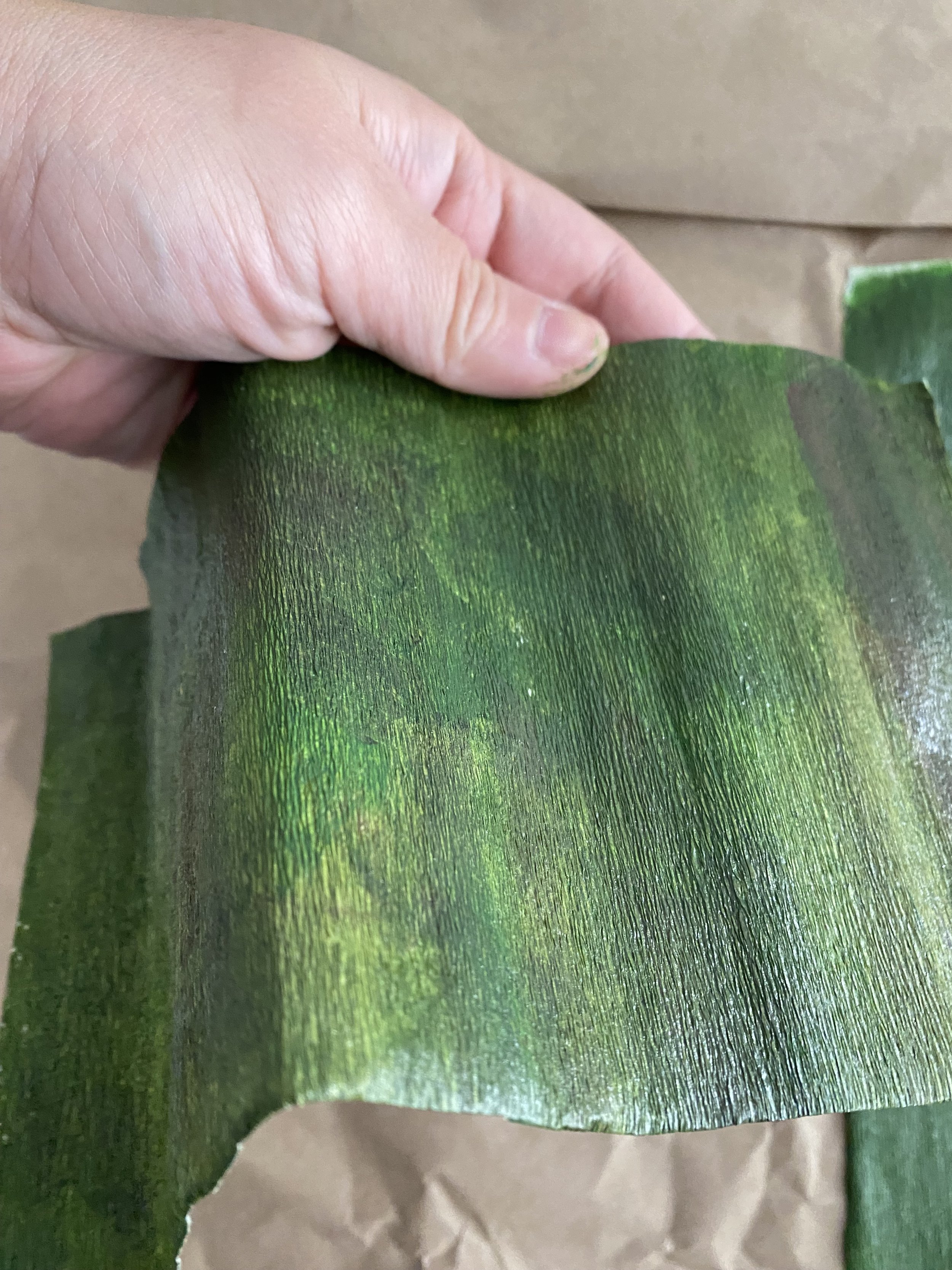
Here is a side by side comparison of using the same paint colours but different medium and slightly different technique on white doublette/double-sided crepe paper. The right side is the matte medium and the left side is the glazing medium. Can you see the luminosity in the left one? Can you see the consistency in the right one?

Whatever medium you use is simply a matter of preference. It ultimately depends on your end goal and your aesthetic.
But if you’re finding it difficult to use acrylic paint on crepe paper, try a medium. Experiment with the texture and effect. Give it a try!
WANT TO LEARN MORE?
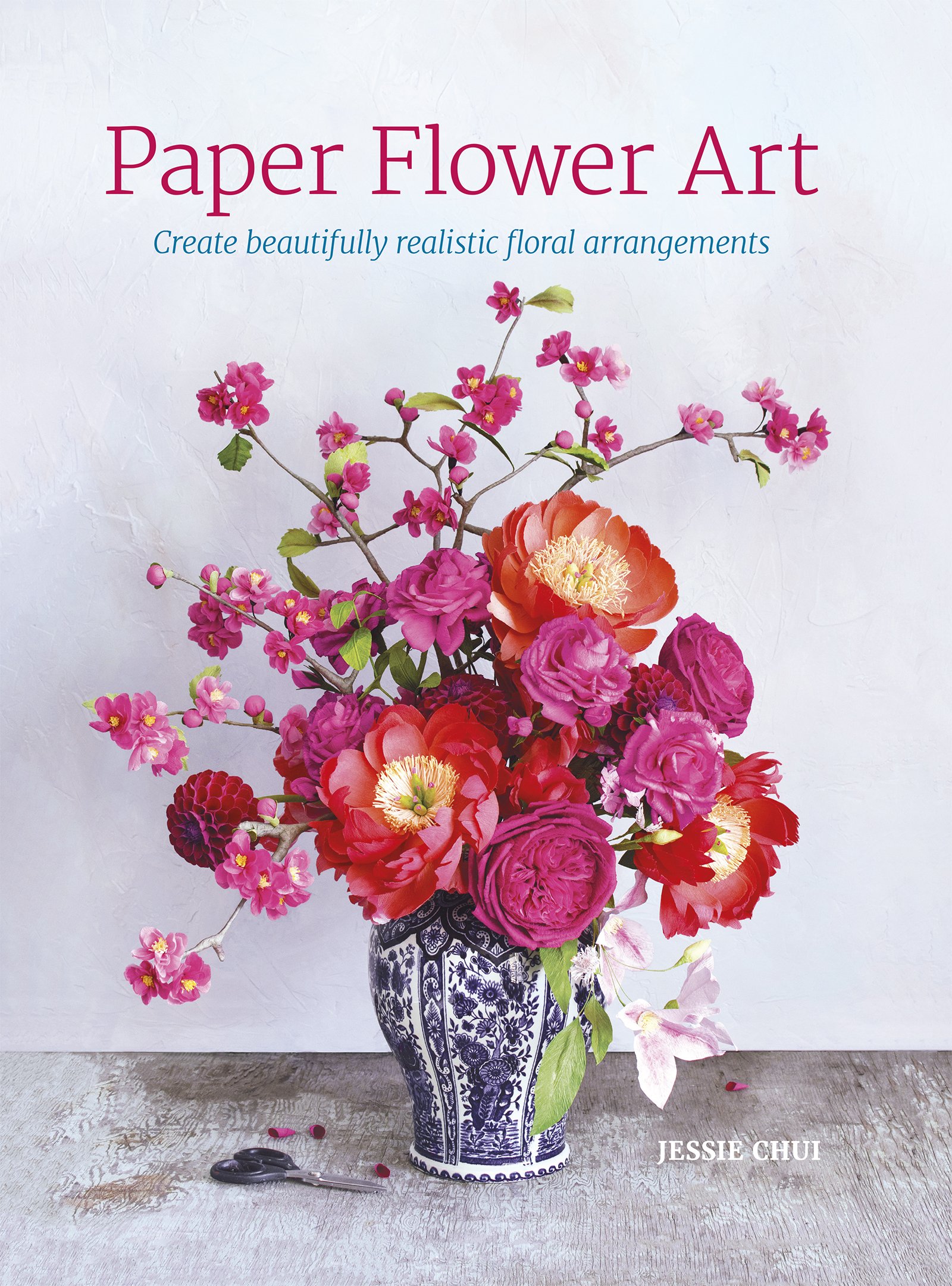
I share how I colour my crepe paper using various mediums before and after putting together the paper flowers in my book, Paper Flower Art (GMC, 2019) (BUY IN HARDCOVER or IN PAPERBACK) or head to my education website, CRAFTED TO BLOOM, for more in-depth learning.