Making a Sunflower | Part 1 - Planning and Thinking through the Process
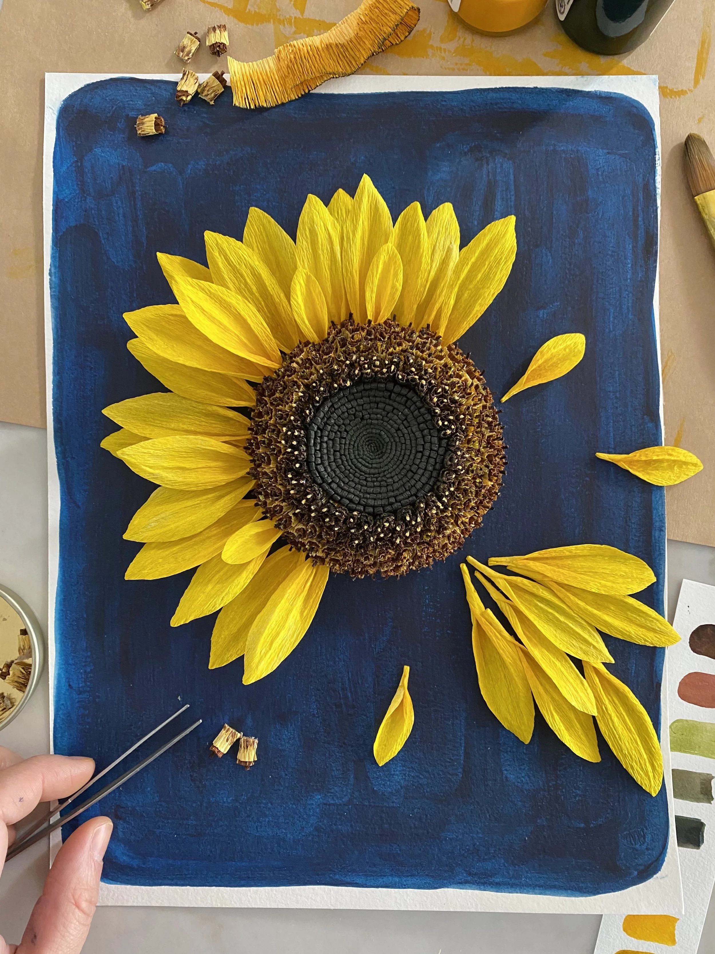
Sunflower commission in progress
This is Part 1 of a 2-Part series. Part 2 talks about how I experimented and executed the paper sunflower.
This flower is incorporated into The Sweetest Thing, a mixed-media piece by Gee Horton, and as of Spring 2022, the work was acquired by the Cincinnati Art Museum for its permanent collection. It is currently being exhibited in The Coming of Age show at the Museum.
I must admit - I’ve never had any desire to make a sunflower. I’ve never been particularly fascinated by the centre or it’s sunny glow. I think it’s because I’m more drawn to flowers that move in the wind, and sunflowers don’t really. Maybe they sway a little. And to me sunflowers are relatively flat-looking compared to other flowers.
I was forced to reconsider with this commission. It was also the first time in a long long time that I struggled so much with the structure of the piece. There were many false starts, experimentation, and lots of fear. I would try something, like it, and then glue it on, and then hate it. Or I’d like it, but the uncertainty of how much I liked it would drive me to stop because I’d be afraid that I’ll end up tearing it all up anyways down the road and have to start that section all over again. So often I’d sit and think and just imagine what I could do, what I should do, to make it happen. Never had I ever been held by so much fear of wasted efforts.
The process
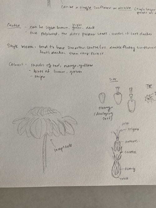
Sketches of the shape I wanted of the sunflower from the side
The process itself was not simple and I started as I always do when I approach a flower - I consider what’s underneath it all. What structure do I need to create in order to create a centre that looks like [this] and keep the petals looking like [this]. Then I go from there and consider in conjunction with the type of paper that would keep the shape, look transparent, look opaque, hold water without changing shape, or would be good with dry mediums, and so on.
Nailing down the vision
I didn’t know much about sunflowers so I did some research by searching for images of its anatomy, of different varieties of sunflowers, at different angles. I tried to look for micro, close up shots so I could see the details. I often find that it helps to decide on a specific sunflower and specific look to recreate. When I have too many inspirational images, I get very indecisive about what to tackle and what characteristics to emphasize. You might feel this way too.
I knew that the only way I could fall in love with making the sunflower was if I made one that had traits and fine art principles that I was drawn to - petals with movement and centres with dimension and depth. I also had to consider that the sunflower was going to be photographed within an illustration for prints. From personal experience, I knew that a photographer would shoot it straight on with the light evenly distributed, which likely won’t catch the type of shadows that would be the most flattering for paper flowers (I tend to like to shoot my flowers with the light coming from the side). So I knew that I had to exaggerate certain aspects of the final product to ensure that it would look the best in any lighting.
The sunflower I ended up choosing was a dwarf sunflower with a proportionally larger centre than the petals. It was the closest to the dimensions that my client provided. The look I wanted was of a sunflower that had been blooming for awhile, but with seed pods in the centre that had not yet matured.
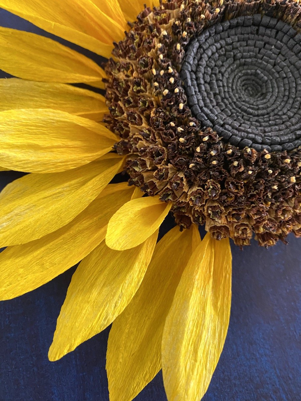
I chose a black centred sunflower (as opposed to the green and yellow) because dark colours recede suggesting depth. To further emphasize dimension, I created a donut-like centre where the centre dips and the outer edges of the centre gently curve down towards the petals. Front on, you get sucked into the dark hole-like centre, while the surrounding ring glows as a result of the high colour contrast; from the side, you can see the seed pods rising from the petals and dipping in the centre. I wanted to create a character!
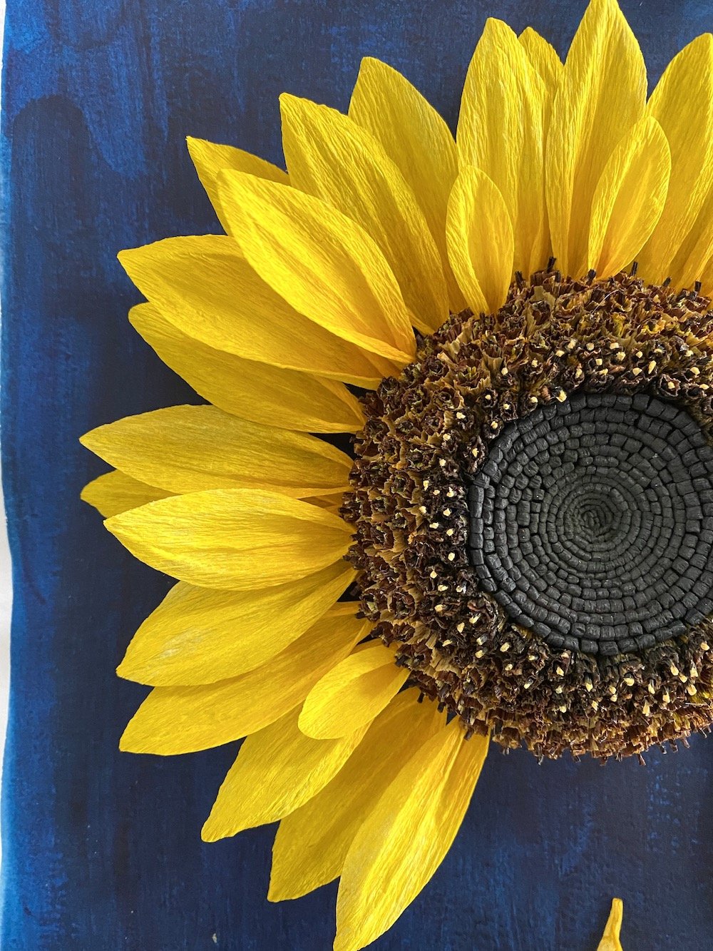
I also preferred the shorter petal sunflowers because they looked more delicate to me…and well, I love delicate looking things. I wanted there to be a balance between the centre and the outer petals. I loved the sunflowers with unique colouring (those red stripe ones are glorious!), yet they seemed uncommon enough for people to be confused of what type of flower it might be. I wanted to make sure that anyone who looked at it would know immediately that it was a sunflower. Yellow seemed like the safest choice.
Once I was able to really set my mind on a specific vision, it made it so much easier to turn my mind to the actual construction and execution of it. I’ll talk about that in the next post!